Bar Chart
Overview
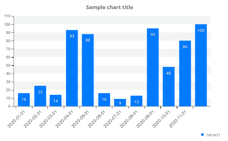
A bar chart displays data series as columns. A chart may contain one or more data series. If you display multiple data series on a bar chart, the series are display next to each other. All displayed data series constitute a separate column of different color. Each bar is separately displayed in the legend. The legend shows the user the type of data for each series. Users are allowed to enable or disable each bar by clicking on legend items.
Customization
Bar colors on a horizontal bar chart are automatically determined but can also be specified. By default, columns contain all associated values and the bars’ corners are not rounded. You can decide where each data point is displayed or if they should be displayed at all.
Features
| Lasso | Brush | Zoom | Dot Tooltip | Line Tooltip | Simple Tooltip | Custom Tooltip | Click event | |
|---|---|---|---|---|---|---|---|---|
| BarChart |  |
|
|
|
|
|
|
|
Example
Creating a Bar Chart