Advanced Filter component
An advanced filter component applies a filter to a DataDescriptor using filter criteria of any complexity. The filter can either be used as a standalone component or combined with the ListGrid component.
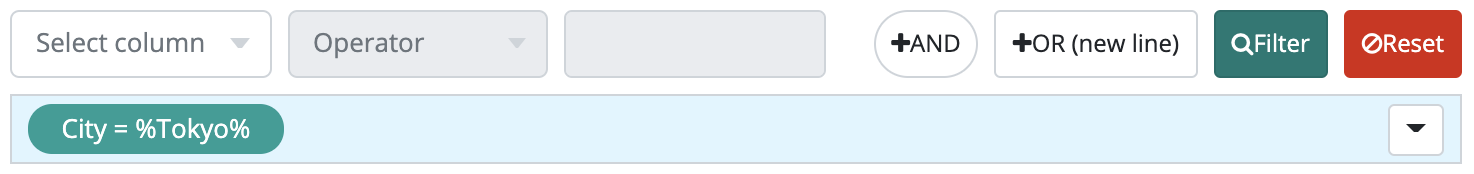
The advanced filter enables you to use multiple filter criteria connected by a logical operator. First, specify a column name and a filtering option:
- in set
- not in set
- is null
- is not null
- equals
- not equals
- contains
- not contains
- undefined
- not starts with
- ends with
- not ends with.
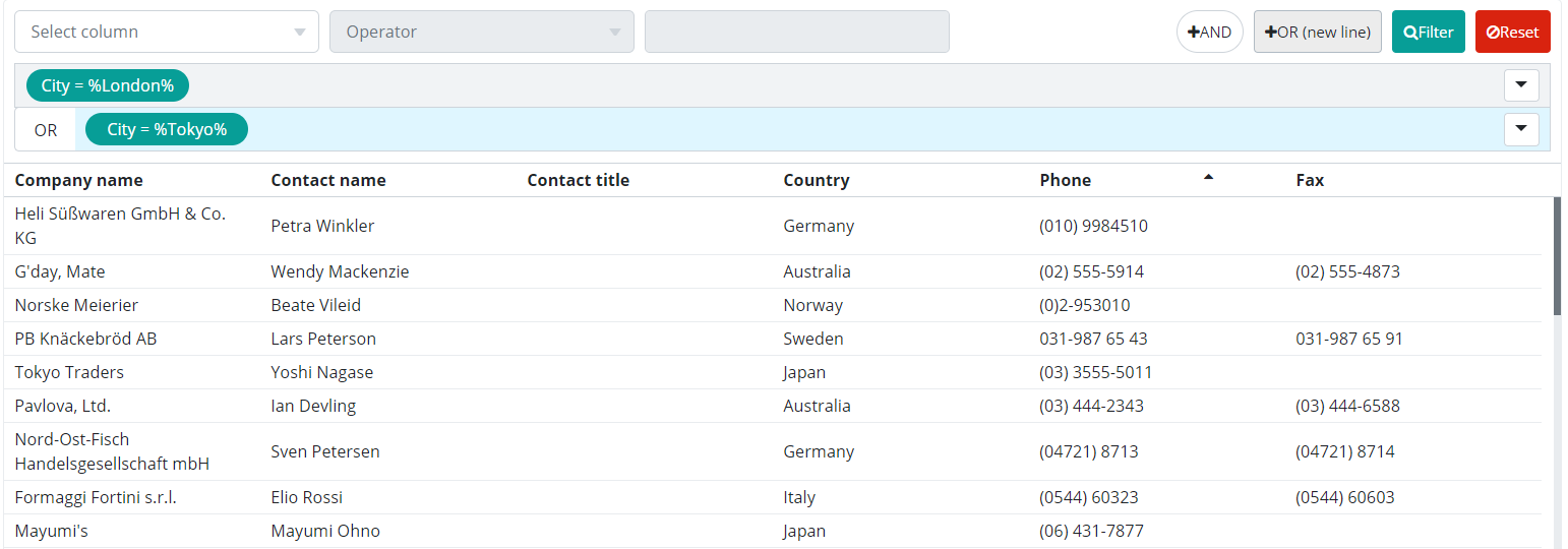
The next step is to provide a filtering value. In the below example, we want to filter for companies based in London and Tokyo. First, we specify a filter criterion for the city column with the value "London", then a new one with the value "Tokyo". The two criteria are connected with an "OR" operator. Criteria that are connected with an AND operator are placed next to each other in the same row. Criteria that are connected with an OR operator are placed below each other.
The filter also contains an editor that enables the user to enter a basic filter criterion. You can also find the column selector, an operator selector and a filter value editor component. These make it possible to define a filter element that can be later attached to the previously created filter elements.
Alongside the editor you will find an ‘AND’ button whose purpose is to add the recently edited element to previous elements using an AND connection. The button is enabled for use only if the edited element itself is valid which means all necessary parameters have been specified. By clicking on the button the filter criterion is added to a previously selected row.
Also, an ‘OR’ button is located next to the ‘AND’ button that is enabled if the current filter criterion is valid. By clicking on the ‘OR’ button one is able to attach the recently edited filter element to the previous elements using an OR connection. This way the filter element will be displayed in a new row, also making it the currently selected row. Thus the user is able to define a criterion up to any degree of complexity.
Filter elements in each row can be dragged and dropped over filter rows. If the user hovers with the mouse over a filter element, the filter element will display 4 buttons. Individual filter elements are disabled by clicking on the buttons and they won’t be included in the filter criterion or they can even be negated, thus the filter criterion will contain the inverse of the original one. It is also possible to regain the editing of a filter element, this is when the filter criterion in the filter element is displayed again in the editor and is modified freely. The ‘AND’ and ‘OR’ buttons are not displayed, instead, a ‘Save’ button is there. By clicking on the ‘Cancel’ button the editing process is canceled and modifications are lost; the ‘Save’ button sets the previous filter element to its recently edited state.
If a row is active, it is highlighted in blue. Consequently, when you're adding a new criterion to the previous ones, the new one will be added to the active (blue) one. Use the mouse pointer to drag&drop criteria and rearrange them. You can clear all filter criteria by clicking on the "Reset" button.
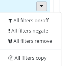
At the end of each row, you see a dropdown arrow. Click on that arrow and you will see a dropdown list of options (see the picture below). By clicking on "All filters negate" , you can easily negate the filter criteria. Also, you can edit the filter criteria, disable them or remove them.
The Reset button on the filter element deletes the element. This way the filter element is permanently removed from the filter criteria.
Setting the language or customizing the filter elements’ texts is done by inserting the following entries into a properties file:
- filterbar.valueEditor.placeholder - Placeholder text displayed in the filter input field
- filterbar.columnSelector.placeholder - Placeholder text displayed in the column selector menu until a column is selected or the current selection is deleted.
- filterbar.columnSelector.tooltip - Texts displayed if the user hovers with the mouse over the column selector drop-down menu
- filterbar.operatorSelector.placeholder - Placeholder text displayed in the operator type selection menu until a filter operator is selected or the currently selected operator is deleted.
- filterbar.operatorSelector.tooltip - Text displayed if the user hovers with the mouse over the filter condition.
- operator.[operator name in lowercase] - The name of the operator as displayed to the user
- operator.short.[operator type name in lowercase] - Shortened form of operator in the filter element’s criterion text.
- filterbar.editingWarningTitle - ‘Editing in progress’ warning header
- filterbar.editingWarningTitle - ‘Editing in progress’ warning message
- filterbar.menu.allOnOff - Menu item text to enable/disable all filter criteria
- filterbar.menu.allNegate - Menu item text to negate all filter criteria
- filterbar.menu.allRemove - Menu item text to remove the filter row
- filterbar.menu.allCopy - Menu item text to copy the filter row
- filterbar.andButtonTitle - Text of the ‘AND’ button
- filterbar.orButtonTitle - Text of the ‘OR’ button
- filterbar.cancelButtonTitle - Text of the ‘Cancel’ button
- filterbar.saveButtonTitle - Text of the ‘Save’ button
- filterbar.filterButtonTitle - Text of the button to start filtering
- filterbar.clearButtonTitle - Text of the button to reset component
Find more information on setting the language here: MessageSourceAPI .
Supported events:
Show, Hide, Animations, Hotkey, Drag&Drop
Style customization
Name |
Type |
Default value |
Derived value |
Computed value |
Comment |
|---|---|---|---|---|---|
| $filterbar-advanced-bg-active | color | darken($highlight-color, 3%) | $filterbar-advanced-bg-active-->darken($highlight-color, 3%)-->darken( #eefaff, 3%) | darken( #eefaff, 3%) | Active bar background color in case of a Filterbar AdvancedFilter. |
| $filterbar-advanced-menu-bg | color | $primary | $filterbar-advanced-menu-bg-->$primary-->#079e97 | #079e97 | Filter menu background color in case of a Filterbar AdvancedFilter. |
| $filterbar-advanced-menu-color | color | $white | $filterbar-advanced-menu-color-->$white-->#fff | #fff | Filter menu font color in case of a Filterbar AdvancedFilter. |
| $filterbar-advanced-menu-negate-bg | color | $danger | $filterbar-advanced-menu-negate-bg-->$danger-->#D9230F | #D9230F | Filter menu negated background color in case of a Filterbar AdvancedFilter. |
| $filterbar-advanced-menu-edited-bg | color | $warning | $filterbar-advanced-menu-edited-bg-->$warning-->#ffc107 | #ffc107 | Edited filter menu background color in case of a Filterbar AdvancedFilter. |