Calendar Complex component
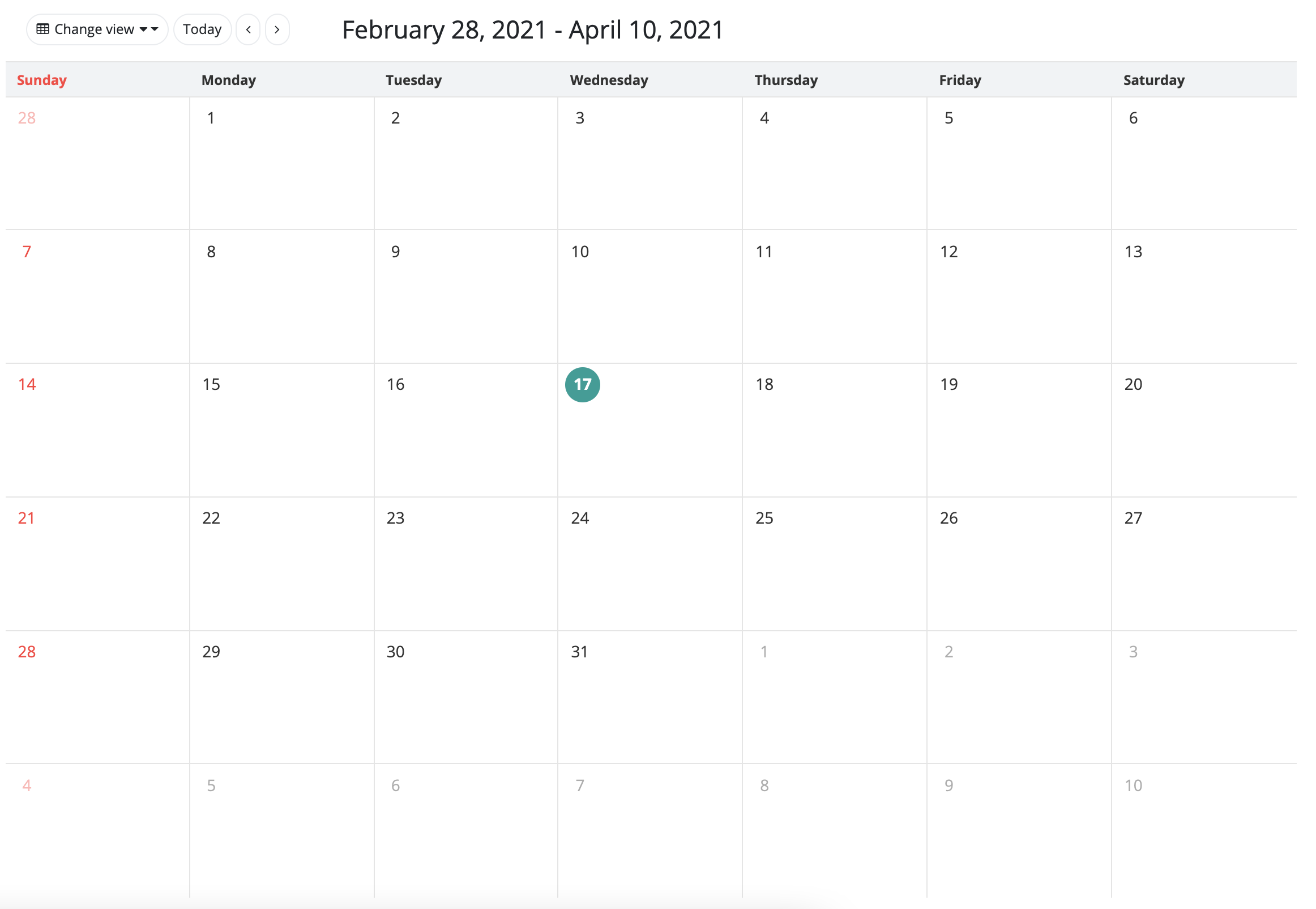
The calendar component displays a calendar on the interface. Scheduled events can also be displayed in these calendars. By default, the calendar is in a weekly view mode (the component displays one week, and lists out the events of that week). The component also supports a daily and a monthly view.
The component can read data from a database, through a DataDescriptor. In this case, the component provides a default event builder, which can create calendar schedule objects based on database records. This component can also implement a custom schedule builder class, with which a schedule object can be filled up from any custom data structure. The custom element builder needs the ScheduleFromRecordSettings interface to be implemented.
These scheduled events are grouped within the component in calendars that can be managed together. These calendars can be displayed, and when this happens, every scheduled event in those calendars will be displayed. They can also be hidden, in a similar fashion. A new calendar can also be created, with the calendar component.
The component also allows the user to move the scheduled events to other dates. If this functionality is enabled, and the user moves a scheduled event, to another date, the scheduled event data will be saved automatically, and the interface will refresh itself. The component can allow a move event handler, in which case the program logic decides if the user can move that specific event to another date. For more information, see the description of the BeforeMoveEvent interface.
Supported events:
Show, Hide, Click, ScheduleClick, ViewChange, MoveScheduleBeforeSave
Style customization
This component does not support style customization at this time.