Donut Chart
Overview
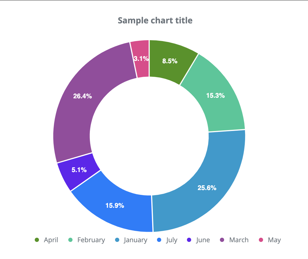
A donut chart is a circle diagram with an empty area in the middle. The chart displays data series As a circle with data points visualized as the slices of a circle. The length of each slice is determined by calculating their proportion to the entire circle. The color of circle slices is automatically determined, but you can also specify them. Each circle slice is displayed separately on the legend, providing information to the user about the chart’s data categories. Slices are automatically displayed in percentage (meaning what percentage of the entire circle they represent).
Customization
You can modify if the actual data values, a percentage or no labels should be displayed on the slice. Slice thickness is automatically calculated, but you can also modify it. As mentioned, the colors of the chart are automatically determined, but you can specify them.
Features
| Lasso | Brush | Zoom | Dot Tooltip | Line Tooltip | Simple Tooltip | Custom Tooltip | Click event | |
|---|---|---|---|---|---|---|---|---|
| DonutChart |  |
|
|
 |
|
|
|
|
Example