Radiobutton Formitem component
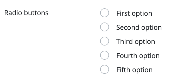
Use this component to place a radio button on the form. The radio button is used to select only one value from a set of values. Each value has its own radio button. By default, these are displayed under each other, but they can be set to appear next to each other.
The use of the component is only recommended if the set of values is small, so that the radio buttons don't expand the page too much.
The component reads the values automatically from the database, if the related parameters are set, or the values can be loaded with using a custom code. The component is a form item, so it can be placed on, and will be handled by the Form component. The component can be used on its own, but then the developer must implement event and value handlers.
A radio button item can be created in multiple ways:
It can be created, programmatically. This means that the component is created manually, it is placed on the interface manually, and its set of values are also defined manually, through the code.
It can be created by using a DataDescriptor. The component's set of values is defined in this DataDescriptor. In this chase, the DataDescriptor column has no mandatory parameters, but a set of values must be specified within the values tag. If it is not specified, the component will have an empty set of values on the interface.
Creating a RadioButtonItem, based on the DataDescriptor column above:
The component can be based on two DataDescriptors. One can specify the component itself, and the other can contain the component values. In this case, the name of the DataDescriptor, that contains the values must be specified in the component DataDescriptor's column. The data column and displayed column's name must be specified as well. Data in the data column will be saved in the component DataDescriptor, and the display column's values will be displayed on the interface. For example, if you want the user to pick a country, but only want to save the country ID in the database, you should follow the example:
Supported events:
Show, Hide, Change, Focus, Animations, Click, MouseEvents, Touch, HotKey, Drag&Drop
Style customization
This component does not have specific variables to use for style customization. However, you can use custom style classes and Bootstrap variables to change the appearance of this component.