Verticalsplitter Layout component
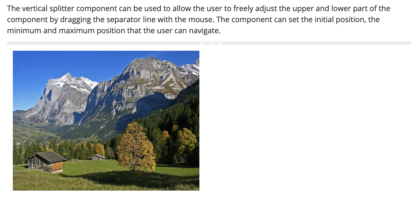
The component enables you to display two containers below each other on the interface where you can insert components arbitrarily. The default size for containers can be pre-set, but the user may resize them by moving the separating line up and down. The size of the containers always changes simultaneously , that is, if the size of the upper container decreases, the size of the lower one increases.
You may set a minimum and a maximum size for the container that cannot be overridden by the user.
Supported events:
Show, Hide, Animation, MouseEvents, Scroll, Drag&Drop,
Style customization
Name |
Default value |
Derived value |
Computed value |
Comment |
|---|---|---|---|---|
| $splitter-bg-color | $white | $splitter-bg-color-->$white-->#fff | #fff | Splitter layout background color. |
| $splitter-border | none | none | Splitter layout frame settings. | |
| $splitter-padding | 0 | 0 | Inner margin for the two outlined areas within a splitter component. | |
| $splitter-margin | 0 | 0 | Within-frame margin for the splitter component. | |
| $splitter-handle-bg-color | $border-color | $splitter-handle-bg-color-->$border-color-->#e9ecef | #e9ecef | Separating bar background color. |
| $splitter-handle-circle-color | $white | $splitter-handle-circle-color-->$white-->#fff | #fff | Color of the 3 dots in the middle of a separating bar. |
| $splitter-bar-color | $splitter-handle-bg-color | $splitter-bar-color-->$splitter-handle-bg-color-->$border-color-->$gray-200-->#e9ecef | #e9ecef | Background color for the area surrounding the 3 dots in the middle of the separating bar. |
| $splitter-bar-color-active | $primary | $splitter-bar-color-active-->$primary-->#079e97 | #079e97 | Active background color for the area surrounding the 3 dots in the middle of the separating bar. |