Gauge Chart
Overview
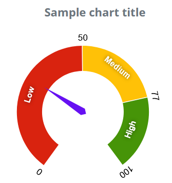
A gauge chart is a chart resembling an analog instrument where one or more needles indicate the measured value. The chart is capable of displaying multiple series, but each series can only contain one type of data. Each series is represented on the chart as a separate needle. You can also specify one or more ranges and sections. These are represented as colored arcs on the circumference of the instrument’s scale. By default, if you do not specify any sections, the chart area is divided into three parts of equal size. You can specify the starting value and color of each section. The default colors are red, yellow and green. The chart’s default display is setting is a speedometer gauge. A speedometer’s readings increase from the left to the right, the minimum value being on the left side and the maximum value being on the right side. If the specified value does not fall into to the measured range (it is below the lower threshold or above the upper threshold), the needle points to the lower or upper thresholds.
Customization
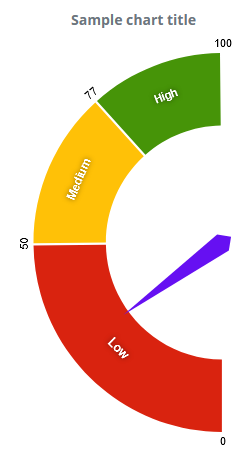
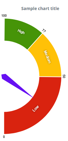
The chart offers other displays, such as displaying the chart horizontally, or tilted to the left or right side, along with the default speedometer display You can also specify the colors used in the chart.
Features
| Lasso | Brush | Zoom | Dot Tooltip | Line Tooltip | Simple Tooltip | Custom Tooltip | Click event | |
|---|---|---|---|---|---|---|---|---|
| GaugeChart |  |
|
|
 |
|
|
|
|
Example