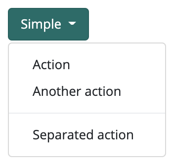
Dropdownbutton Simple component

This component represents a button on the interface. If the user clicks on this button, a dropdown list appears. You can customize the button and add an icon or text to it. You can also add menu items to the dropdown menu. You can apply animations to the component, these are visible when the user clicks on the button and the list drops down. Also, an optional counter on the button shows e.g. the number of unread messages.
Supported events:
Animatable, Clickable, HandleMouseEvents, Touchable, HandleHotKey, CanDrop, Dragabble
Style customization
| Name | Type | Default value | Derived value | Computed value | Comment |
|---|---|---|---|---|---|
| $dropdown-item-padding-y | number | 0.25rem | - | - | Vertical padding for dropdown menu buttons. |
| $dropdown-item-padding-x | number | 1.25rem | - | - | Horizontal padding for dropdown menu buttons. |