Daterangepicker Formitem component
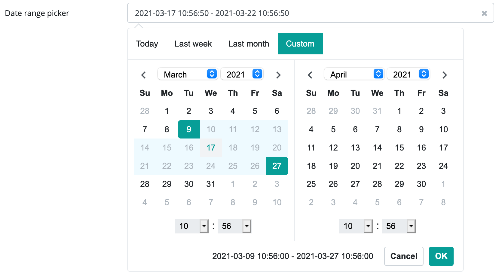
This component allows the user to pick a date range. The component guarantees that only valid date ranges can be picked (correctly formatted, has valid maximum and minimum dates and the minimum date is less or equal to the maximum date).
The component displays an input field for the user, that when clicked, will open two drop down calendars. The left side calendar will allow the user to pick a starting date, the right side calendar will allow the user to pick the ending date. The user can also type in a date, but if it is not in the correct format, the component will revert back to its default value.
The component also allows the use of predefined date ranges, which the user can chose by its name (Previous month, week etc). This makes it easier for the user to input frequently used date ranges. These predefined ranges can be added by using the DateRangePicker.addPredefinedRange(java.lang.String, java.lang.String, java.util.Date, java.util.Date) method.
Supported events:
Show, Hide, Change, Focus, Animations, Edit, Click, KeyboardEvents, MouseEvents, Touch, HotKey, Drag&Drop
Style customization
Name |
Default value |
Derived value |
Computed value |
Comment |
|---|---|---|---|---|
| $date-picker-active-day-bg-color | $primary | $date-picker-active-day-bg-color-->$primary-->#079e97 | #079e97 | Background color for a selected day. |
| $date-picker-active-day-border | 1px solid transparent | 1px solid transparent | Frame settings for a selected day. | |
| $date-picker-active-day-color | $white | $date-picker-active-day-color-->$white-->#fff | #fff | Label color for a selected day. |
| $date-picker-active-range-bg-color | $highlight-color | $date-picker-active-range-bg-color-->$highlight-color-->#eefaff | #eefaff | Interval background color for a selected day. |
| $date-picker-active-range-color | $gray-500 | $date-picker-active-range-color-->$gray-500-->#adb5bd | #adb5bd | Interval color for a selected day. |
| $date-picker-bg-color | $white | $date-picker-bg-color-->$white-->#fff | #fff | Component background color. |
| $date-picker-border-color | $border-color | $date-picker-border-color-->$border-color-->#e9ecef | #e9ecef | Frame color for the outermost component. |
| $date-picker-buttons-bg-color | $date-picker-bg-color | $date-picker-buttons-bg-color-->$date-picker-bg-color-->#fff | #fff | Background color for the container encasing the buttons. |
| $date-picker-buttons-border-top-color | $border-color | $date-picker-buttons-border-top-color-->$border-color-->#e9ecef | #e9ecef | Color of the separating element between DatePicker and buttons. |
| $date-picker-buttons-border-top-width | 1px | 1px | Width of the separating element between DatePicker and buttons. | |
| $date-picker-caret-border-color | $gray-400 | $date-picker-caret-border-color-->$gray-400-->#ced4da | #ced4da | Component’s small arrow (pointing to the input field) frame color. |
| $date-picker-caret-color | $white | $date-picker-caret-color-->$white-->#fff | #fff | Component’s small arrow (pointing to the input field) color. |
| $date-picker-day-off-bg-color | $white | $date-picker-day-off-bg-color-->$white-->#fff | #fff | Background color for days outside or within a range. |
| $date-picker-day-off-color | $gray-500 | $date-picker-day-off-color-->$gray-500-->#adb5bd | #adb5bd | Label color for days outside or within a range. |
| $date-picker-disabled-color | $gray-500 | $date-picker-disabled-color-->$gray-500-->#adb5bd | #adb5bd | Color for disabled components. |
| $date-picker-font-family | arial | arial | Font used. | |
| $date-picker-hover-bg-color | $gray-200 | $date-picker-hover-bg-color-->$gray-200-->#e9ecef | #e9ecef | Hover background color for a day. |
| $date-picker-next-color | $input-color | $date-picker-next-color-->$input-color-->#495057 | #495057 | Increment arrow color. |
| $date-picker-selected-text-color | inherit | inherit | VARIABLE NOT USED | |
| $date-picker-selected-text-font-size | $font-size-base | $date-picker-selected-text-font-size-->$font-size-base-->1rem | 1rem | Label size for a selected date. |
| $date-picker-selected-text-padding-right | $spacer * 0.6 | $date-picker-selected-text-padding-right-->$spacer * 0.6-->1rem * 0.6 | 0.6rem | Spacing to the right of a selected label from the buttons. |
| $date-picker-table-bg-color | $date-picker-bg-color | $date-picker-table-bg-color-->$date-picker-bg-color-->#fff | #fff | Background color for a month. |
| $date-picker-table-border-color | $white | $date-picker-table-border-color-->$white-->#fff | #fff | Frame color surrounding a month. |
| $date-picker-time-bg-color | $gray-200 | $date-picker-time-bg-color-->$gray-200-->#e9ecef | #e9ecef | Time display background color. |
| $date-picker-time-border-color | $gray-200 | $date-picker-time-border-color-->$gray-200-->#e9ecef | #e9ecef | Time display frame color. |
| $date-picker-time-color | inherit | inherit | Time display text color. | |
| $date-picker-today-bg-color | $light | $date-picker-today-bg-color-->$light-->mix(#f8f9fa, #e9ecef, 50%) | mix(#f8f9fa, #e9ecef, 50%) | Today’s color. |
| $date-picker-today-border | $date-picker-active-day-border | $date-picker-today-border-->$date-picker-active-day-border-->1px solid transparent | 1px solid transparent | Today’s frame color. |
| $date-picker-today-color | $primary | $date-picker-today-color-->$primary-->#079e97 | #079e97 | Today’s text color. |