Activitystream Complex component
Components discussed:

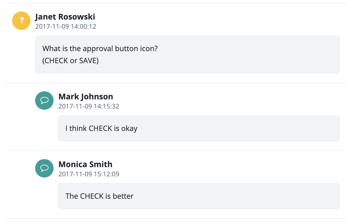
The component displays activity stream items in a chronological order. This component is mainly used for displaying events and comments. Users can comment on events, the previous/replied to comments will be displayed as quotes. The individual items can be displayed under each other, chronologically, ( ActivityStreamType.DEFAULT ) or grouped by topics, under each other, chronologically ( ActivityStreamType.TOPIC_VIEW ).
The component can be based on a DataDescriptor, in which case, the displayed items will be built from the specified DataDescriptor columns. The component does not modify the DataDescriptor, it only displays items based on its contents.
The component has a default item renderer, but a custom one can be implemented as well. Items created with the custom renderer can be made of any components, and can have any program logic applied to it. To create a custom renderer, the ActivityStreamItemCreator interface must be implemented. This implemented class can be instantiated by calling the ActivityStream.setItemCreator(ActivityStreamItemCreator) method. After it is called, the items will be created with this custom renderer class.
Supported events:
Show, Hide, Animation, MouseEvents, Scroll, HotKey, Drag&Drop
ActivityStreamItem
This component cannot be used on its own. This components represents an ActivityStream item. This is where the item's data and settings can be specified, but it cannot be used or displayed on its own.
Supported events:
Show, Hide, Animation, Click, MouseEvents, Scroll, Touch, Drag&Drop
Style customization
Name |
Default value |
Derived value |
Computed value |
Comment |
|---|---|---|---|---|
| $activity-element-bg-color | transparent | transparent | Activity item background. | |
| $activity-element-border-top | 1px solid $border-color | $activity-element-border-top-->1px solid $border-color-->1px solid $gray-200-->1px solid #e9ecef | 1px solid #e9ecef | Activity upper separating bar. |
| $activity-element-bg-color-hover | $gray-100 | $activity-element-bg-color-hover-->$gray-100-->#f8f9fa | #f8f9fa | Activity item hover background color. |
| $activity-element-border-color-hover | $border-color | $activity-element-border-color-hover-->$border-color-->#e9ecef | #e9ecef | Activity item hover frame color. |
| $activity-element-padding-top | $spacer * 0.7 | 0.7 | Activity item upper padding. | |
| $activity-margin | $spacer 0 | $activity-margin-->$spacer 0-->1rem 0 | 1rem 0 | Activity stream margin. |
| $activity-icon-bg-color | $light | $activity-icon-bg-color-->$light-->mix(#f8f9fa, #e9ecef, 50%) | mix(#f8f9fa, #e9ecef, 50%) | Activity icon default background color. |
| $activity-time-color | $gray-600 | $activity-time-color-->$gray-600-->#6c757d | #6c757d | Activity date text color. |
| $activity-time-font-size | $font-size-base * 0.84 | 0.84 rem | Activity date font size. | |
| $activity-time-margin-bottom | $activity-time-font-size | $activity-time-margin-bottom --> $activity-time-font-size --> $font-size-base * 0.84 | 0.84 rem | Activity date lower margin. |
| $activity-time-line-height | $activity-time-font-size | $activity-time-line-height --> $activity-time-font-size --> $font-size-base * 0.84 | 0.84 rem | Activity date row height. |
| $activity-blockquote-font-size | $font-size-base | 1 rem | Activity history item font size. | |
| $activity-blockquote-border-left | 0.35rem solid $border-color | $activity-blockquote-border-left-->0.35rem solid $border-color-->0.35rem solid $gray-200-->0.35rem solid #e9ecef | 0.35rem solid #e9ecef | Activity history item left separator line. |
| $activity-blockquote-padding | 0 $spacer 0.35rem $spacer | $activity-blockquote-padding--> 0 $spacer ($spacer * 0.35) $spacer-->0 1rem 0.35rem 1rem | 0 1rem 0.35rem 1rem | Activity history item padding. |
| $activity-blockquote-margin | 0 0 ($spacer * 0.7) | 0 0 (1 * 0.7) | Activity history item margin. | |
| $activity-blockquote-line-height | ($font-size-base * 1.25) | 1 rem | Activity history item row height. | |
| $activity-username-font-weight | $font-weight-bold | 700 | Activity user name font weight. | |
| $activity-username-margin-bottom | $spacer * 0.35 | 0.35 | Activity user name lower margin. | |
| $activity-username-line-height | 0.7rem | 0.7rem | Activity user name row height. | |
| $activity-username-margin-top | 0.35rem | 0.35rem | Activity user name upper margin. | |
| $activity-username-font-size | $font-size-base * 1.06 | 1.06 rem | Activity user name font size. | |
| $activity-content-line-height | $font-size-base * 1.66 | 1.66 rem | Activity content row height. | |
| $activity-content-margin-right | $spacer * 0.7 | 0.7 rem | Activity content right margin. | |
| $activity-content-background | $light | $activity-content-background-->$light-->mix(#f8f9fa, #e9ecef, 50%) | mix(#f8f9fa, #e9ecef, 50%) | Activity content row height. |
| $activity-content-padding | $spacer * 0.7 | 0.7 rem | Activity content padding. | |
| $activity-content-border | 1px solid $border-color | $activity-content-border-->1px solid $border-color-->1px solid $gray-200-->1px solid #e9ecef | 1px solid #e9ecef | Activity content frame. |
| $activity-content-border-radius | $border-radius | 0.25 rem | Activity content corner rounding radius. | |
| $activity-content-font-size | $font-size-base | 1 | Activity content font size. | |
| $activity-padding-left-level-1 | $spacer * 2.5 | 2.5 rem | Indentation to the left of a first-level activity. | |
| $activity-padding-left-level-2 | 2 * $activity-padding-left-level-1 | $activity-padding-left-level-2-->2 * $activity-padding-left-level-1-->2 * 2.5rem | 5rem | Indentation to the left of a second-level activity. |
| $activity-padding-left-level-3 | 3 * $activity-padding-left-level-1 | $activity-padding-left-level-3-->3 * $activity-padding-left-level-1-->7.5rem | 7.5rem | Indentation to the left of a third-level (or other) activity. |