Listbox Simple component
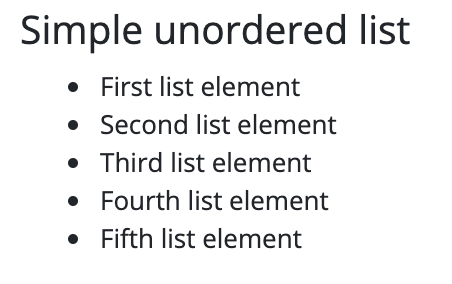
This component displays an ordered or unordered list on the interface. Each item of the ordered list comes with a number before it, and with the item content indented. Items of an unordered list are preceded by bullet points and the item text is indented.
Not only texts, but also any component can be placed in a list component and will be displayed on the interface as described above.
Supported events:
Show, Hide, Animations, MouseEvents, Scroll, Drag&Drop
Style customization
This component does not have specific variables to use for style customization. However, you can use custom style classes to change the appearance of this component.