Button Simple component
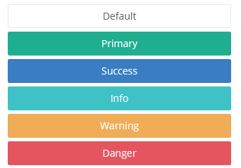
Use this component to place a button on the interface. The button can be customized, and it can have an icon and/or text on it. You can implement the click event handler on the server-side.
Other menu items can be placed on the button, and they are displayed to the user when they press the button. The menu items have their own click events that can be set individually.
The button component supports using animations that can be used when the button appears or disappears. Use the method setAnimation() to set the animation. For animation types, see the Animation enum.
A counter can also be placed on the right side of the button. The counter can have any integer number. This can be used to enumerate content; for example, the amount of unread messages.
Style customization
Name |
Default value |
Derived value |
Computed value |
Comment |
|---|---|---|---|---|
| $btn-default-color | inherit | inherit | ||
| $btn-default-bg | $body-bg | $btn-default-bg-->$body-bg-->$white | #fff | |
| $btn-default-border | $input-border-color | $btn-default-border-->$input-border-color-->$gray-400 | #ced4da | |
| $btn-icon-outline-color | inherit | inherit | Button label color. | |
| $btn-icon-outline-bg-color | transparent | transparent | Button background color. | |
| $btn-icon-outline-border | 1px solid $border-color | $btn-icon-outline-border-->1px solid $border-color--> $gray-200 --> #e9ecef | 1px solid #e9ecef | Button icon frame color. |
| $btn-icon-outline-hover-color | $white | $btn-icon-outline-hover-color-->$white--> | #fff | Button icon hover background color. |
| $btn-icon-outline-padding | ($spacer * 0.25) ($spacer * 0.5) | $btn-icon-outline-padding-->($spacer * 0.25) ($spacer * 0.5)--> | (0.25rem) (0.5rem) | Button inner margin. |
| $btn-rounded-border-radius | ($spacer * 4) | $btn-rounded-border-radius-->($spacer * 4)-->(4rem) | (4rem) | Corner radius for rounded buttons (.btn-rounded) |
| $btn-padding-y-xs | $btn-padding-y-sm * 0.8 | $btn-padding-y-xs-->$btn-padding-y-sm * 0.8-->$input-btn-padding-y-sm * 0.8-->0.25rem * 0.8 | 0.2rem | Lower and upper padding for mini buttons. |
| $btn-padding-x-xs | $btn-padding-x-sm | $btn-padding-x-xs-->$btn-padding-x-sm-->0.5rem | 0.5rem | Mini button side padding. |
| $btn-font-size-xs | $btn-font-size-sm * 0.8 | $btn-font-size-xs-->$btn-font-size-sm * 0.8-->0.75rem*0.8 | 0.6rem | Mini button font size. |
| $btn-line-height-xs | $btn-line-height-sm | $btn-line-height-xs-->$btn-line-height-sm-->$line-height-sm-->1.5 | 1.5 | Mini button line height. |
| $btn-border-radius-xs | $btn-border-radius-sm | $btn-border-radius-xs-->$btn-border-radius-sm-->$border-radius-sm-->0.2rem | 0.2rem | Rounded mini button corners. |