Filtering in the listgrid component
The ListGrid component supports multiple filtering types:
Adaptive filter
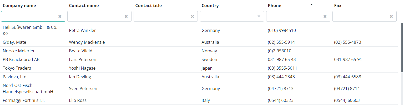
The adaptive filter is a built-in filter in the ListGrid. Enabling the adaptive filter displays an input field for each column. Specify a value and press Enter to show the filter results.
To enable the adaptive filter, use the following code:
Simple filter
The SimpleFilter is a standalone component. To enable the SimpleFilter component, use the following code:
Read more about the SimpleFilter here .
Advanced filter
The AdvancedFilter is a standalone component. To enable the AdvancedFilter component, use the following code:
Read more about the AdvancedFilter here .
Text filter
The TextFilter is a standalone component. To enable the TextFilter component, use the following code:
Read more about the TextFilter here .
Custom filter
If the above filter types are not what you're looking for, you can still create your custom filter. Value input fields can be of any type, so you can even specify dates by using a DatePicker component as an input field. Operators depend on the column type. Click here to read more on how to create a custom filter.
Default criteria
ListGrids retrieves data from an associated DataDescriptor. These data values are displayed on the ListGrid. Filters used as examples in the above sections are visible to users. Users are able to set filter criteria for the ListGrid. Default criteria allow the developer to set filter criteria in the ListGrid that is neither visible to users, nor can they set them. Users cannot set the default criteria. These criteria is added during the development time and cannot be set from the UI in runtime.
Editor types
As for the adaptive filter, simple filter and advanced filter, the input field automatically changes to the corresponding editor type. The below table contains default editor types. You can also override default editor types (see the detailed descriptions in the Editor types chapter).
Column type (database) |
Column type (DataDescriptor) |
Default editor type |
Operators |
|---|---|---|---|
| Text String Varchar Varchar2 Clob Char Character | TEXT | TextEditor | in set not in set is null not null equals not equals contains not contains starts with not starts with ends with not ends with |
| Integer Int BigInt | INTEGER | IntegerEditor | in set not in set is null not null equals not equals less then less or equal greater than greater or equal |
Double Real |
DOUBLE | NumberEditor | in set not in set is null not null equals not equals less then less or equal greater than greater or equal |
| Date | DATE | DatePicker | is null not null equals not equals less than less or equal greater then greater or equal |
| Datetime Timestamp | DATETIME | DatePicker | is null not null equals not equals less than less or equal greater then greater or equal |
| Boolean Bool | BOOLEAN | Checkbox | equals |
If the column also contains a value set, the input field is displayed as a combobox in the filter. If you choose a "set/not set" as an operator, the input field changes to a text field and you can list the filter values, separated by commas.