Card Layout component
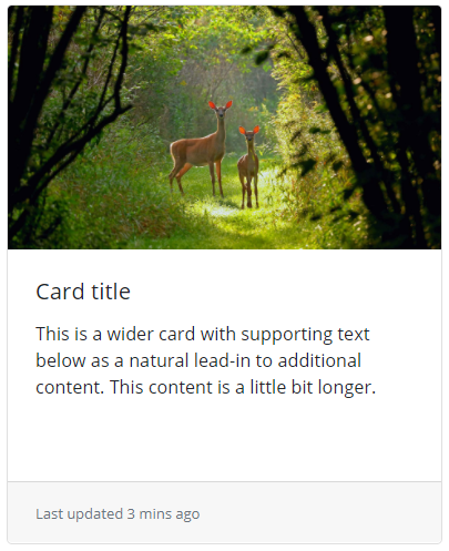
A card is a content container that helps you organize information on the screen. A card consists of a header, a card body and a footer. Headers and footers are only optional parts of a card component. Within the card body, you can place any text or even any JBStrap component. In the above example, we placed an image into the card header, a text into the card body and the automatically refreshed "Last updated..." information into the footer. The text in the card body also has a title.
Card groups
Groups of JBStrap cards are displayed as single, attached elements with the same height and width.
Card decks
A card deck only differs from a card group because individual cards are not attached to each other. On the other hand, headers and footers appear lined up, just with some spacing between cards.
Accordion
An accordion contains collapsible group items and – as its name suggests – you can collapse or expand the items in the whole component.
Style customization
There plenty of options to customize a card component. You can set the background color, text color, border color. Also, there is an option to specify spacing between individual cards. Use the following Sass variables:
| Name | Type | Default value | Derived value | Computed value | Comment |
|---|---|---|---|---|---|
| $card-spacer-y | number | 0.75rem | Vertical spacing between cards | ||
| $card-spacer-x | number | 1.25rem | Horizontal spacing between cards | ||
| $card-border-width | number | $border-width | $card-border-width-->$border-width-->1px | 1px | Border width |
| $card-border-radius | number | $border-radius | $card-border-radius-->$border-radius-->0.25rem | 0.25rem | Border radius |
| $card-border-color | color | rgba($black, .125) | $card-border-color-->rgba($black, .125)-->rgba(#000, .125) | rgba(#000, .125) | Border color |
| $card-inner-border-radius | number | subtract($card-border-radius, $card-border-width) | Card inner border radius | ||
| $card-cap-bg | color | rgba($black, .03) | $card-cap-bg-->rgba($black, .03)-->rgba(#000, .03) | rgba(#000, .03) | Header/footer background color |
| $card-cap-color | color | null | Header/footer body color | ||
| $card-height | number | null | Card height | ||
| $card-color | color | null | Card body color | ||
| $card-bg | color | $white | $card-bg-->$white-->#fff | #fff | Card background color |
| $card-img-overlay-padding | number | 1.25rem | Text padding if the card itself is an image | ||
| $card-group-margin | number | $grid-gutter-width/2 | $card-group-margin-->$grid-gutter-width/2-->30px/2-->15px | 15px | Margin size of card groups |
| $card-deck-margin | number | $card-group-margin | $card-deck-margin-->$card-group-margin-->$grid-gutter-width/2-->30px/2-->15px | 15px | Margin size of card decks |
| $card-columns-count | number | 3 | Number of card columns | ||
| $card-columns-gap | number | 1.25rem | Gap size between card columns | ||
| $card-columns-margin | number | $card-spacer-y | $card-columns-margin-->$card-spacer-y-->0.75rem | 0.75rem | Column margin |