Textitem Formitem component
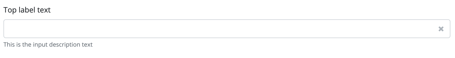
The component implements a text input field. This allows the user to input any text into the input field, that can be later used by the application. If the maximum text length is 255, then the field will be single line, if it is more than 255, it will be a larger input field (TextArea).
The component supports the use of masks. With the use of a mask, the user can be forced to use a certain text format, and ensure that the text is displayed in the correct format. For more information about masks, see the setMask method description.
The TextItem component is a form item, that can be placed on a Form component, and the form handles it as well. The component can be used on its own, but in that case, the handling of its events and values must be provided by the program code.
Style customization
This component does not have specific variables to use for style customization. However, you can use custom style classes to change the appearance of this component.