HorizontalSplitter Layout component
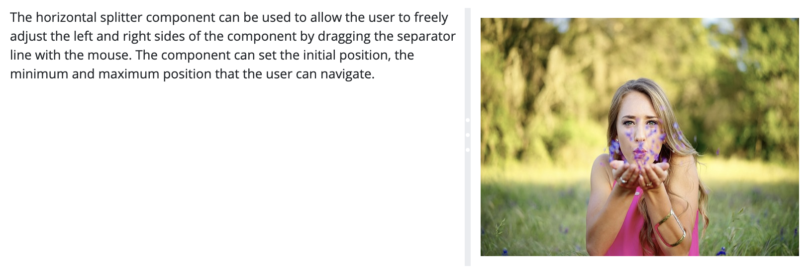
The component enables you to visualize two containers next to each other on the interface where you can insert components. You may enter a default size for the container, however, it is also possible to resize both containers by moving the separator to left or to the right. The size of both containers always changes simultaneously, that is, if the container to the right shrinks, the one to the left increases.
You may set a minimum and a maximum size for the container that cannot be overridden by the user.
Supported events:
Show, Hide, Animation, MouseEvents, Scroll, Drag&Drop
Style customization
Name |
Default value |
Derived value |
Computed value |
Comment |
|---|---|---|---|---|
| $splitter-bg-color | $white | $splitter-bg-color-->$white-->#fff | #fff | Splitter layout background color. |
| $splitter-border | none | none | Splitter layout frame settings. | |
| $splitter-padding | 0 | 0 | Inner margin for the two outlined areas within a splitter component. | |
| $splitter-margin | 0 | 0 | Within-frame margin for the splitter component. | |
| $splitter-handle-bg-color | $border-color | $splitter-handle-bg-color-->$border-color-->#e9ecef | #e9ecef | Separating bar background color. |
| $splitter-handle-circle-color | $white | $splitter-handle-circle-color-->$white-->#fff | #fff | Color of the 3 dots in the middle of a separating bar. |
| $splitter-bar-color | $splitter-handle-bg-color | $splitter-bar-color-->$splitter-handle-bg-color-->$border-color-->$gray-200-->#e9ecef | #e9ecef | Background color for the area surrounding the 3 dots in the middle of the separating bar. |
| $splitter-bar-color-active | $primary | $splitter-bar-color-active-->$primary-->#079e97 | #079e97 | Active background color for the area surrounding the 3 dots in the middle of the separating bar. |