Horizontal Bar Chart
Overview
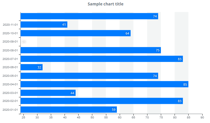
A horizontal stacked bar chart is a bar chart that displays data series as bars. A chart may contain one or more data series. If multiple series are displayed on a horizontal stacked bar chart, the series are display after one another. This chart is an axis-based chart, but it is also horizontal. It has an X and a Y axis that are rotated 90° compared to a regular chart, making the X axis vertical and the Y axis the horizontal axis. Bars are visualized on the chart according to this rotation. All displayed data series constitute a separate column of different color. Each bar is separately displayed in the legend. The legend shows the user the type of data for each series. Users are allowed to enable or disable each bar by clicking on legend items.
Customization
Bar colors on a horizontal stacked bar chart are automatically determined but can also be specified. By default, columns contain all associated values and the bars’ corners are not rounded. You can change these settings, rounding off bar corners. You can also control where each data point is displayed or if they should be displayed at all.
Marker setting also work with horizontal stacked bar charts, but they only modify the legend’s appearance; markers are not displayed on individual columns. Markers are not displayed on columns, therefore users can select data points and display a tooltip by clicking on the entire area of a bar.
Features
| Lasso | Brush | Zoom | Dot Tooltip | Line Tooltip | Simple Tooltip | Custom Tooltip | Click event | |
|---|---|---|---|---|---|---|---|---|
| HorizontalBarChart |  |
|
|
 |
|
|
|
|
Example