JBStrap listgrid component

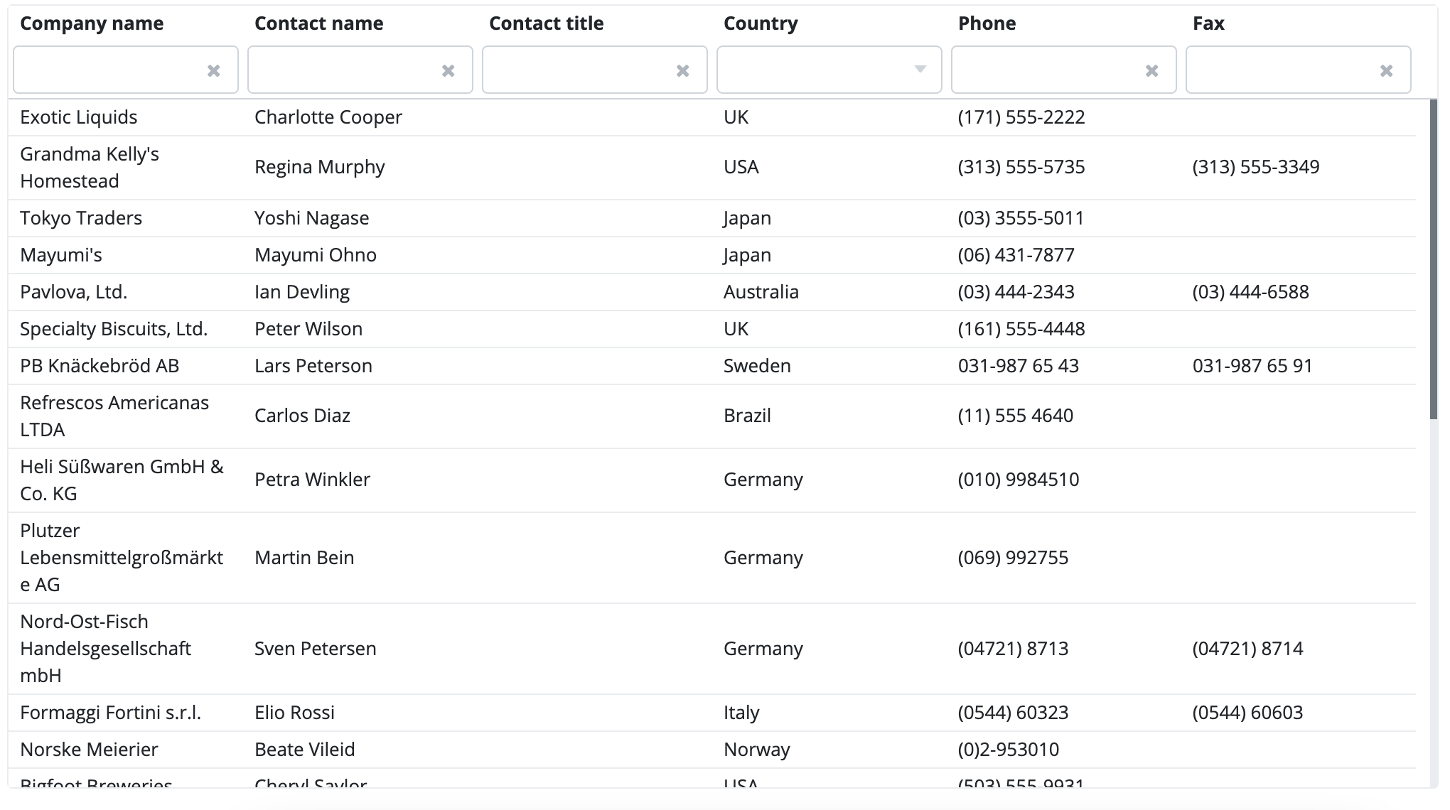
The ListGrid component displays a data table on the screen. The ListGrid supports many functionalities.
Header
Column title
A ListGrid headerben jelennek meg az oszlopok által meghatározott title-ek. Ha nincs title megadva valamely oszlop esetén akkor azon oszlop esetében az oszlop neve fog megjelenni. Ha a ListGrid data descriptorra épül, akkor a data descriptor column tagben megadott title tag értéke lesz a mező címkéje. A title tagben megadható a title kapcsos zárójelek közt, amely azt jelenti, hogy a kapcsos zárójelek közti értéknek megfelelő message source érték fog megjelenni, amelynek a kulcsa megegyezik a kapcsos zárójelek közti értékkel. A message source használatával könnyen nyelvesíthetők a ListGird oszlopainak fejléce.
Például egyszerű title megadás data descriptor esetén:
Message source title esetén feltételezzük, hogy létezik valamely properties állományban a következő kulcs és értékkel rendelkező message:
column1.title=Column One Title
Például message source title megadás data descriptor esetén:
Turn on/off header
ListGrid display a header that is enabled by default. To hide it, use the following line of code:
Sorting
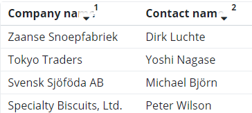
If you have the header turned on, go to the respective column and you will notice an arrow pointing upwards and downwards. This is where you can sort the column in ascending or descending order. You can sort multiple columns at the same time. The sorting direction is indicated by a red arrow.

If you sort multiple columns at the same time, the order of sorted columns is marked by an index number that appears next to the column name:

By default, sorting is always enabled in a ListGrid. If you want to turn it off, you have to do it from code:
Row selection
In the ListGrid, you can select an entire row by clicking on a specific row. In the buttons above the ListGrid, you have to specify if you want to select a single row or multiple rows.
In the below picture, we selected the single row option and clicked (with the left mouse button) on a specific row.

In the below picture, we chose the "Multiselect" option and used the left mouse button to select multiple rows at the same time, while pressing the Ctrl button.

Adding and removing columns
Click on any column header and you will notice a hamburger menu icon (three horizontal bars below each other). Click on this menu and you will see a dropdown list of the columns in the ListGrid. Check the ones you would like to include in the ListGrid. Columns are displayed in the ListGrid in the same order they were added to the ListGrid or in alphabetical order.

You can close the column list (see the above picture), click on the "X" in the upper right corner. If you want the column list to automatically close upon selecting a column, use the following code:
All columns are filterable by default, but you can turn it off if need be:
In the column list, columns appear in the same order they were added to the ListGrid (default) or in an alphabetical order.
Use the following code for the column order:
Use the following code for the alphabetical order:
Moving columns is enabled by default. If you want to turn it off, you have to do it from code:
Rearranging columns
You can also rearrange columns within a ListGrid. To do this, you have click on the series of dots in the column header (the rightmost option), grab the column header and start dragging it to its new place.

Resizing columns
You can manually resize columns in the ListGrid. It is also enabled by default, and to turn it off, you have to use the following line of code:
Data export
You have the following options to export data from the ListGrid:
- Microsoft Excel 97 (.xls)
- Microsoft Excel 2007 (.xlsx)
- Comma separated value (.csv)
- Tab separated text (.txt)
You have to use the following code snippet to implement data export in the ListGrid:
The snippet uses the below parameters:
- CLIENT: client name
- EXPORT_TYPE: file type (e.g. ExportTypes.XLSX)
- FILENAME: file name
- ONLY_DISPLAYED_COLUMNS: a boolean value to specify whether only the visible columns should be included in the export file
- SEPARATOR: a character that separates individual values (e.g. a comma in case of a CSV file)
Exporting only the visible columns into Excel:
Exporting all columns into a CSV file:
Lazy fetch and single-page fetch
Lazy fetch is the default setting of data retrieval in the ListGrid. Lazy fetch means that continuous scrolling is enabled and the necessary data is automatically loaded. The browser only loads the visible section of the data. Contrarily, the single-page option means that data is loaded on one a single page within the ListGrid and you cannot continuously scroll, but only switch to the next page.
Subclasses
ListGridColumn
This class represents a grid column. Use this class to modify column settings, e.g. specifying width or a renderer.
Supported events:
Show,Hide,Animatable,Click,MouseEvents,Scroll,Touch,Drag&Drop
Features and functions
Sets the column width, Column content alignment, Header text, Sets a formatter, Sets a renderer, Word wrap.
ListGridRow
This class represents a grid row. Use this class to perform grid row operations.
Supported events:
Animatable,Click,MouseEvents,Touch,Drag&Drop
Features and functions
Gets the row's original record, gets the row record, gets the row index, row status, modifies a row record, sets a row value.
Style customization
| Name | Type | Default value | Derived value | Computed value | Comment |
|---|---|---|---|---|---|
| $listgrid-font-size | number | $font-size-base | $listgrid-font-size-->$font-size-base--> | 0.8125rem | Font size used within a ListGrid. |
| $listgrid-background-color | color | $white | $listgrid-background-color-->$white--> | #fff | Background color for the ListGrid component. |
| $listgrid-selected-row-color | color | $highlight-color | $listgrid-selected-row-color-->$highlight-color--> | #eefaff | Background color for a highlighted ListGrid row. |
| $listgrid-hovered-row-color | color | lighten($highlight-color, 1.5%) | $listgrid-hovered-row-color-->lighten($highlight-color, 1.5%)--> | Hover color for ListGrid rows. | |
| $listgrid-resizer-width | number | 0.7rem | - | 0.7rem | ListGrid resize width. |
| $listgrid-resizer-color | color | darken($primary, 5%) | $listgrid-resizer-color-->darken($primary, 5%)--> | ListGrid resize color. | |
| $listgrid-resizer-inactive-color | color | transparent | - | transparent | - |
| $listgrid-padding | number | 0 | - | 0 | Inner margin for ListGrid. |
| $listgrid-scrollbar-width | number | $scrollbar-width | $listgrid-scrollbar-width-->$scrollbar-width-->0.36rem | 0.36rem | ListGrid scrollbar width. |
| $listgrid-scrollbar-height | number | $scrollbar-height | $listgrid-scrollbar-height-->$scrollbar-height-->0.71rem | 0.71rem | ListGrid scrollbar height. |
| $listgrid-scrollbar-bg | color | $scrollbar-bg | $listgrid-scrollbar-bg-->$scrollbar-bg-->#e9ecef | #e9ecef | ListGrid scrollbar background color. |
| $listgrid-scrollbar-color | color | $scrollbar-color | $listgrid-scrollbar-color-->$scrollbar-color-->#6c757d | #6c757d | ListGrid scrollbar color. |
| $listgrid-scrollbar-hover-color | color | $scrollbar-hover-color | $listgrid-scrollbar-hover-color-->$scrollbar-hover-color-->#495057 | #495057 | ListGrid scrollbar hover color. |