Tab Layout component
This component collects the tab components. This means that the component is not visible on the user interface; it is only used to group tab page components. Please note that the tab page components cannot be placed on the interface directly; they must be placed through the tab component. Otherwise, neither the tab, nor the tab page component will function properly.
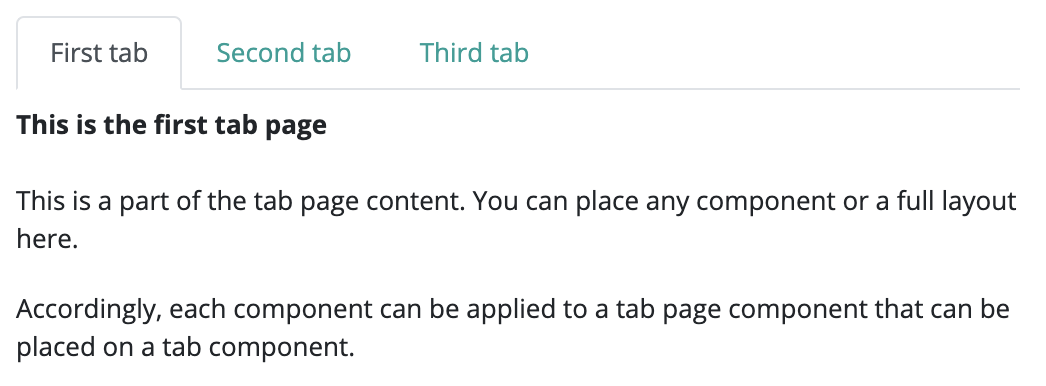
Only one tab page component can be displayed from a group. However, every tab will be visible on the top. By default, when displaying the first tab page component will be active, and have its contents displayed. If the user clicks on another tab, the currently active tab page will disappear, only it's clickable tab will remain, while the new tab page will be displayed.
With the help of this component, we can set the state of the assigned tab pages. By default, these tab pages appear on the upper side of the tab, but it can be modified to be on the left or right side. It is also possible to switch between the tab pages through code, either by using their index, or going forward or backward by one tab. Click handlers can also be placed on the individual tab pages, or the same handler can be set to all tab pages, so the event of the user changing pages can be handled.
Supported events:
Show, Hide, Animation, Drag&Drop, TabClick
Style customization
Name |
Default value |
Derived value |
Computed value |
Comment |
|---|---|---|---|---|
| $nav-tabs-border-color | $gray-300 | $nav-tabs-border-color-->$gray-300-->#dee2e6 | #dee2e6 | Tab border color. |
| $nav-tabs-border-width | $border-width | $nav-tabs-border-width-->$border-width-->1px | 1px | Tab border width. |
| $nav-tabs-border-radius | $border-radius | $nav-tabs-border-radius-->$border-radius-->0.25rem | 0.25rem | Tab border radius. |
| $nav-tabs-link-hover-border-color | $gray-200 $gray-200 $nav-tabs-border-color | $nav-tabs-link-hover-border-color-->$gray-200 $gray-200 $nav-tabs-border-color-->#e9ecef #e9ecef $gray-300-->#e9ecef #e9ecef #dee2e6 | #e9ecef #e9ecef #dee2e6 | Tab link hover border color. |
| $nav-tabs-link-active-color | $gray-700 | $nav-tabs-link-active-color-->$gray-700-->#495057 | #495057 | Tab link active color. |
| $nav-tabs-link-active-bg | $body-bg | $nav-tabs-link-active-bg-->$body-bg-->$white-->#fff | #fff | Tab link active background color. |
| $nav-tabs-link-active-border-color | $gray-300 $gray-300 $nav-tabs-link-active-bg | $nav-tabs-link-active-border-color-->$gray-300 $gray-300 $nav-tabs-link-active-bg-->#dee2e6 #dee2e6 $body-bg-->#dee2e6 #dee2e6 #fff | #dee2e6 #dee2e6 #fff | Tab link active border color. |