Checkboxitem Formitem component
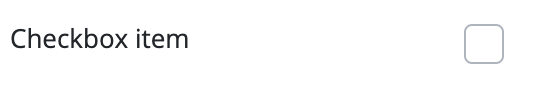
The checkbox item is used to input a logic value. The user can check the box that is displayed, which is interpreted as a true value, if the box is not checked, it is considered a false value. The field does not support the use of the null value.
The Checkbox component is a form item, that can be placed on a Form component, and the form handles it as well. The component can be used on its own, but in that case, the handling of its events and values must be provided by the program code.
Supported events:
Show, Hide, Change, Focus, Animations, Click, MouseEvents, Touch, Drag&Drop
Style customization
This component does not have specific variables to use for style customization. However, you can use custom style classes and Bootstrap variables to change the appearance of this component.