Stacked Area Chart
Overview
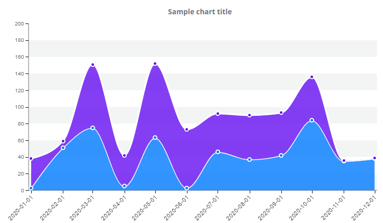
A stacked area chart is a series of data points connected with lines, with a colored area below the lines. An area chart can contain one or more areas. You can specify if an area should be filled with a solid color or a color gradient. If more than one data series are displayed on the same chart, they are stacked upon each other and do not overlap. The second area’s “0” data point is located at the top of the first area. An area chart is an axis-based chart that has an X and Y axis. Data points are placed on these two axes. All displayed data series constitutes a separate area of different color. Each area is separately displayed in the legend. The legend shows the user the type of data for each series. Users are allowed to enable or disable each area by clicking on legend items.
Customization
Lines and area colors on a stacked area chart are automatically chosen, but can also be specified. Line type can be modified and lines can be displayed as curves, stepped or dashed lines. Line thickness can also be modified. By default, the markers on the displayed line show the position of each data point, the color, shape and size of which can be modified. You can also turn off the markers. Once turned off, markers are not visible and thus the click events and tooltips also do not work.
Features
| Lasso | Brush | Zoom | Dot Tooltip | Line Tooltip | Simple Tooltip | Custom Tooltip | Click event | |
|---|---|---|---|---|---|---|---|---|
| StackedAreaChart |  |
|
|
|
|
|
|
|
Example