Timeline Complex component
Components discussed:

The component displays a timeline. Events and other information can be displayed in a chronological order for the user. The component can read data from the database, and it can display them, using either the default or a custom display method. If you need to create a custom timeline item builder class, it must implement the TimelineItemCreator interface, and the class must be specified for the component, by using the Timeline.setItemCreator(TimelineItemCreator) method. The custom builder class implementation can use any components, and these can be displayed on the individual items, so the items can have their own logic and custom operations.
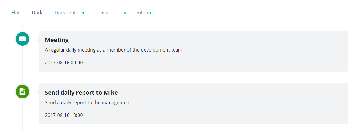
The component supports multiple display types, that can be set and changed easily. These display types are contained in the Timeline.TimelineType enum.
Supported events:
Show, Hide, Animation, Click, MouseEvents, Scroll, Touch, Drag&Drop
TimelineItem
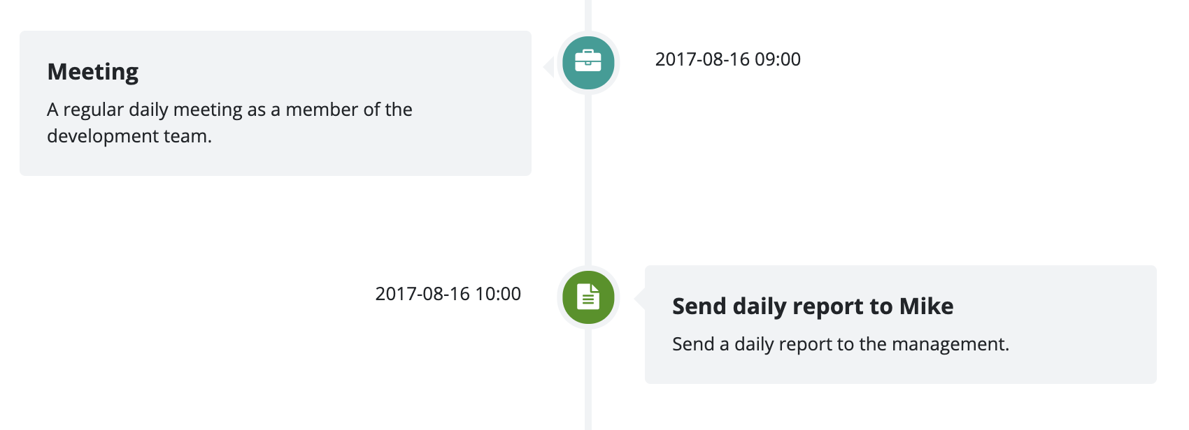
A TimelineItem is not a standalone component, it represents an item in a timeline component. In the below timeline, "Meeting" and "Send daily report to Mike" are examples of timeline items. If you want to customize a timeline item, you need to refer to the Sass variable in the Style customization table. Use the TimelineItem only to access and modify an individual item's settings.

Style customization
Name |
Default value |
Derived value |
Computed value |
Comment |
|---|---|---|---|---|
| $timeline-flat-separator-color | $light | $timeline-flat-separator-color-->$light-->mix(#f8f9fa, #e9ecef, 50%) | mix(#f8f9fa, #e9ecef, 50%) | |
| $timeline-flat-icon-color | $primary | $timeline-flat-icon-color-->$primary-->#079e97 | #079e97 | |
| $timeline-flat-icon-border-width | 0 | 0 | Flat timeline icon frame width. | |
| $timeline-flat-icon-border | none | none | Flat timeline icon frame. | |
| $timeline-flat-margin | 0 ($spacer * 0.7) | $timeline-flat-margin-->0 ($spacer * 0.7)-->0 (1rem * 0.7) | 0 0.7rem | Flat timeline margin. |
| $timeline-flat-icon-width | $spacer * 2.15 | $timeline-flat-icon-width-->$spacer * 2.15-->1rem * 2.15 | 2.15rem | Flat timeline icon container width. |
| $timeline-flat-icon-font-size | $spacer * 0.9 | $timeline-flat-icon-font-size-->$spacer * 0.9-->1rem * 0.9 | 0.9rem | Flat timeline icon font size. |
| $timeline-flat-date-width | $spacer * 7.7 | $timeline-flat-date-width-->$spacer * 7.7-->1rem * 7.7 | 7.7rem | Flat timeline date area width. |
| $timeline-flat-date-max-width | $timeline-flat-date-width | $timeline-flat-date-max-width-->$timeline-flat-date-width-->7.7rem | 7.7rem | Flat timeline date area maximum width. |
| $timeline-flat-date-icon-distance | $spacer * 0.35 | $timeline-flat-date-icon-distance-->$spacer * 0.35-->1rem * 0.35 | 0.35rem | Spacing between the flat timeline icon and date. |
| $timeline-flat-date-font-size | $spacer * 0.65 | $timeline-flat-date-font-size-->$spacer * 0.65-->1rem * 0.65 | 0.65rem | Flat timeline date font size. |
| $timeline-flat-content-hover-bg | $light | $timeline-flat-content-hover-bg-->$light-->mix(#f8f9fa, #e9ecef, 50%) | mix(#f8f9fa, #e9ecef, 50%) | Flat timeline content hover background color. |
| $timeline-padding | $spacer * 1.5 | 1.5rem | Left spacing. | |
| $timeline-icon-size | $spacer * 2.85 | 2.85rem | Icon container size. | |
| $timeline-icon-font-size | $spacer * 1.15 | 1.15rem | Icon font size. | |
| $timeline-icon-border-radius | 0,5 | 0,5 | Icon container rounding. | |
| $timeline-icon-text-align | center | center | Icon alignment. | |
| $timeline-icon-border-width | $spacer * 0.25 | $spacer * 0.25 | Icon container frame width. | |
| $timeline-icon-border | $timeline-icon-border-width solid $light | $timeline-icon-border-->$timeline-icon-border-width solid $light-->0.25rem solid mix($gray-100, $gray-200, 50%) | 0.25rem solid mix( #f8f9fa, #e9ecef, 50%) | Icon container frame. |
| $timeline-line-width | $spacer * 0.3 | 0.3rem | Timeline witdh. | |
| $timeline-dark-line-color | $light | $timeline-dark-line-color-->$light-->mix(#f8f9fa, #e9ecef, 50%) | mix(#f8f9fa, #e9ecef, 50%) | Dark timeline color. |
| $timeline-light-line-color | $white | $timeline-light-line-color-->$white-->#fff | #fff | Light timeline color. |
| $timeline-dark-content-bg | $light | $timeline-dark-content-bg-->$light-->mix(#f8f9fa, #e9ecef, 50%) | mix(#f8f9fa, #e9ecef, 50%) | Dark timeline content background color. |
| $timeline-light-content-bg | $white | $timeline-light-content-bg-->$white-->#fff | #fff | Light timeline content background color. |
| $timeline-block-margin | ($spacer * 2) 0 | 2 0 | Timeline content area margin. | |
| $timeline-content-margin | 0 0 0 ($spacer * 4.3) | 0 0 0 4.3 | Timeline content margin. | |
| $timeline-content-padding | $spacer | $timeline-content-padding-->$spacer-->1rem | 1rem | Timeline content padding. |
| $timeline-content-border-radius | $border-radius | $timeline-content-border-radius-->$border-radius-->0.25rem | .25rem | Timeline content frame rounding. |
| $timeline-content-title-color | inherit | inherit | Timeline content title font color. | |
| $timeline-content-title-font-size | $font-size-lg | $font-size-lg | Timeline content title font size. | |
| $timeline-content-title-font-weight | $font-weight-bold | $font-weight-bold | Timeline content title font size. | |
| $timeline-content-font-size | inherit | inherit | Timeline content font weight. | |
| $timeline-content-body-color | inherit | inherit | Timeline content font color. | |
| $timeline-date-color | inherit | inherit | Timeline content date color. | |
| $timeline-date-font-weight | $font-weight-normal | $font-weight-normal | Timeline content date font weight. | |
| $timeline-date-text-font-weight | 500 | 500 | Font weight for the text above the timeline content. | |
| $timeline-dark-caret-color | $light | $timeline-dark-caret-color-->$light-->mix(#f8f9fa, #e9ecef, 50%) | mix(#f8f9fa, #e9ecef, 50%) | Dark timeline icon content arrow color. |
| $timeline-dark-second-caret-color | $light | $timeline-dark-second-caret-color-->$light-->mix(#f8f9fa, #e9ecef, 50%) | mix(#f8f9fa, #e9ecef, 50%) | Dark timeline icon content arrow color (every second content area). |
| $timeline-light-caret-color | $white | $timeline-light-caret-color-->$white-->#fff | #fff | Light timeline icon content arrow color. |
| $timeline-light-second-caret-color | $white | $timeline-light-second-caret-color-->$white-->#fff | #fff | Light timeline icon content arrow color (every second content area). |
| $timeline-caret-top | $spacer * 1.15 | 1.15rem | Timeline icon content arrow position. | |
| $timeline-caret-size | ($spacer * 0.5) | $timeline-caret-size-->($spacer * 0.5)-->(1rem * 0.5) | 0.5rem | Timeline icon content arrow size. |
| $timeline-center-block-margin | ($spacer * 4) 0 | 4 0 | Mid-line timeline content area margin. | |
| $timeline-center-line-position | -($spacer * 0.15) | -0.15rem | Mid-line timeline position. |