Numberitem Formitem component
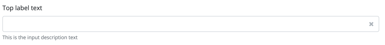
Input field used to enter a numeric value. The component prompts the user to enter a numeric value that is either an integer or a fraction. The component displays an input field where only numeric characters are allowed. Plus and a minus icons are also displayed, used to increment or decrement the component’s value.
A minimum and a maximum value can also be set for the component. In this case the user is allowed to enter a value only within the specified range, and the increment/decrement steps are specified.
The number item component is a form item which means the component can be placed on the Form component and the form fully supports its functionality. The component may be used as a standalone component, but in this case value and event handling must be implemented from code.
Supported events:
Show, Hide, Change, Focus, Animations, Edit, Click, KeyboardEvents, MouseEvents,Touch, HotKey, Drag&Drop
Style customization
This component does not have specific variables to use for style customization. However, you can use custom style classes and Bootstrap variables to change the appearance of this component.