Bubble Chart
Overview
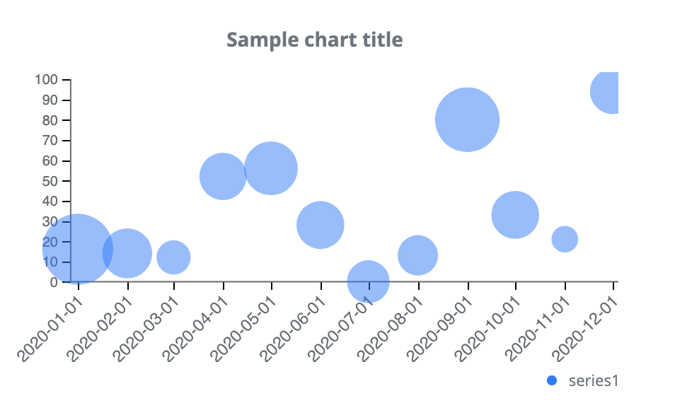
A bubble chart is a special chart that is capable of displaying multiple series. Series data are displayed in two dimensions. Data points are visualized as bubbles, with the bubble center being in the intersection of the X and Y axes according to the Y value. A greater data weight value means a bigger bubble size. Users can see a visualization of not only data values, but also data weight values. In case of multiple series, bubbles are displayed in different colors. The Bubble chart has its own, unique tooltip, as it can list 3 lines of information.
Customization
The chart supports the customization of axes. You can specify prefixes, postfixes for each axis, you can specify striping and turn on/off the gridlines. These settings can be specified separately for each axis, thus allowing for a wide range of customization settings.
Features
| Lasso | Brush | Zoom | Dot Tooltip | Line Tooltip | Simple Tooltip | Custom Tooltip | Click event | |
|---|---|---|---|---|---|---|---|---|
| BubbleChart |  |
|
|
 |
|
|
|
|
Example