Colorpicker Formitem component
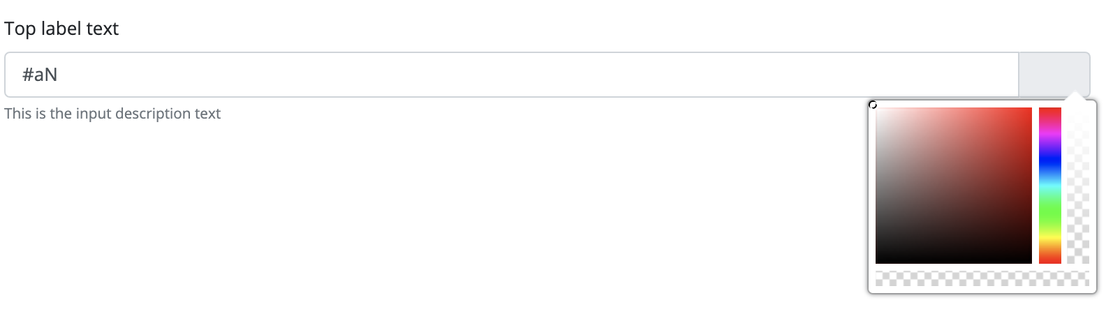
With this component, users can choose a color to be used in the framework as a CSS code. The color picker component's value is always a String. The format of the component can be changed and by default, it uses the hexadecimal format. Other formats that can be used are RGB and RGBA.
If the component has a null value, the color will be completely transparent. If the user edits the color by hand, and specifies an invalid color, the previously selected color will replace it.
The component appears on the interface as an input field, allowing users to input a color code. Next to the field is a button, that brings up a color palette. The user can select a color from here, or use predefined colors. These predefined colors can be created by using the ColorPicker.addColor(String, String) method.
By default, the palette has a small size. The component allows the palette to be displayed in a bigger size, in which case the ColorPicker.setLargePalette(boolean) method can be called, and given the true value.
The color picker component is a form item, so it can be placed on, and will be handled by the Form component. The color picker component can be used on its own, but then the developer must implement event and value handlers.
Supported events:
Show, Hide, Change, Focus, Edit, KeyboardEvents, HotKey, Drag&Drop
Style customization
| Name | Default value | Derived value | Computed value | Comment |
|---|---|---|---|---|
| $colorpicker-selected-base-color | $gray-200 | $colorpicker-selected-base-color-->$gray-200-->#e9ecef | #e9ecef | Color picker default color. |
| $colorpicker-selected-width | $font-size-base * 1.4 | $colorpicker-selected-width-->$font-size-base * 1.4-->1rem * 1.4 | 1.4rem | Color picker item box width. |
| $colorpicker-selected-height | 0,8 | 0,8 | Color picker item box height. | |
| $colorpicker-box-min-width | 9rem | 9rem | Minimum width for color picker box. | |
| $colorpicker-box-shadow | 0 0 ($spacer * 0.2) $shadow-color | $colorpicker-box-shadow-->0 0 ($spacer * 0.2) $shadow-color-->0 0 (1rem * 0.2) rgba(#212529, 0.5) | 0 0 (1rem * 0.2) rgba(#212529, 0.5) | Color picker box frame shadow. |
| $colorpicker-box-padding | $spacer * 0.3 | $colorpicker-box-padding-->$spacer * 0.3-->1rem * 0.3 | 0.3rem | Inner margin for color picker box. |
| $colorpicker-saturation-size | 7rem | 7rem | Color picker box size. | |
| $colorpicker-saturation-size | 7rem | 7rem | Color picker box size. | |
| $colorpicker-box-radius | $border-radius | $colorpicker-box-radius-->$border-radius-->0.25rem | 0.25rem | Color picker frame corner radius. |
| $colorpicked-hue-width | 1rem | - | 1rem | Color picker scale column width. |
| $colorpicked-hue-height | 7rem | 7rem | Color picker scale column height. | |
| $colorpicked-alpha-width | 1rem | - | 1rem | Color picker transparency column width (only in RGBA). |
| $colorpicked-alpha-height | 7rem | 7rem | Color picker transparency column height (only in RGBA). | |
| $colorpicked-color-height | 0.7rem | 0.7rem | Height of the selected color bar in the color picker. | |
| $colorpicked-color-selector-cube-size | 0.7rem | 0.7rem | Size of predefined boxes in the color picker. |