Progressbar Simple component
The progress bar component is used to measure the progress of certain operations that it is assigned to. The bar is filled depending on how much of the work is done or the time elapsed. This component gives feedback to the user about certain processes.
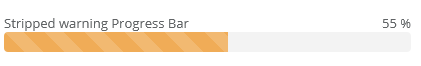
The information displayed by the component can be customized, such as the name of the task, or if it should measure the progress in percentages, etc.
Note that the component doesn't handle or analyze the process it is assigned to. The process needs to give this information to this component. The state of the process is defined by first assigning a number that represents the starting and the end value. A number representing the current state must also be assigned. If the current state value is less or equal with the starting value, the process is considered to have not started yet, meaning 0% done, and it will be displayed as such. If the current state value is greater than, or equal to the end value, the process is considered to be finished, meaning that it is 100% done, and it will be displayed as such.
Supported events :
Show, Hide, Animations, Click, MouseEvents, Drag&Drop
Style customization
The look of the component can be customized, by using SCSS variables. To learn more about this feature, visit the Customization/Style customization page. The component uses the following variables:
Name |
Default value |
Derived value |
Computed value |
Comment |
|---|---|---|---|---|
| $progress-title-color | $body-color | $progress-title-color-->$body-color-->$gray-900-->#212529 | #212529 | Title color. |
| $progress-title-font-size | $font-size-base * 1.15 | $progress-title-font-size-->$font-size-base * 1.15-->$1rem * 1.15 | 1.15rem | Title size. |
| $progress-title-font-weight | $font-weight-base | $progress-title-font-weight-->$font-weight-base-->$font-weight-normal-->400 | Title font weight. | |
| $progress-position-text-color | lighten($body-color, 15%) | $progress-position-text-color-->lighten($body-color, 15%)-->lighten($gray-900, 15%)-->lighten(#212529, 15%) | lighten(#212529, 15%) | Status label color. |
| $progress-position-text-font-size | $font-size-base | $progress-position-text-font-size-->$font-size-base-->1rem | 1rem | Status label size. |
| $progress-position-text-font-weight | $font-weight-base | $progress-position-text-font-weight-->$font-weight-base-->$font-weight-normal-->400 | 400 | Status font weight. |
| $progress-bar-background-color | $primary | $progress-bar-background-color-->$primary-->#079e97 | #079e97 | Progress bar color. |
Related pages