Comboboxitem Formitem component
The component implements a combobox, allowing the user to only input values from a predetermined set of values. The combobox values can be filtered by the user. The component supports sorting, and the set of values can be uploaded from a database as well.
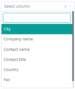
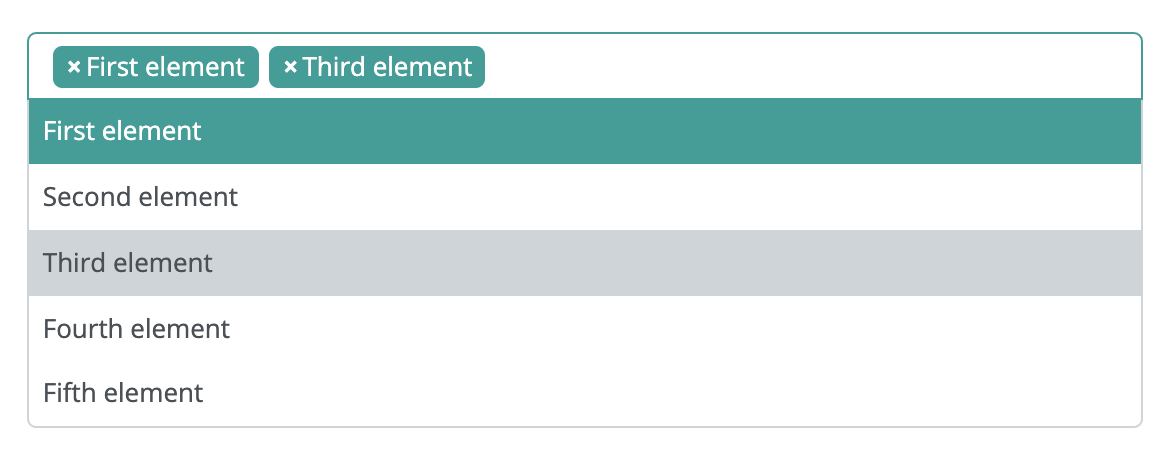
The component can be in multi-select mode or single select. This is a multi select combobox:
The use of the component is recommended, when the selectable set of values is small. If there are too many selectable values, the use of the combobox might slow down. If using a lot of selectable values, the SelectorItem component is recommended instead, since it handles larger amounts of selectable values better.
This component is a form item, which means it can be placed, and it will be handled by the Form component. It can be used on its own, but in this case the developer must implement event and value handlers.
A combobox can be created in multiple ways:
It can be created, programmatically. This means that the component is created manually, it is placed on the interface manually, and its set of values are also defined manually, through the code.
It can be created by using a DataDescriptor. The component's set of values is defined in this DataDescriptor. In this chase, the DataDescriptor column has no mandatory parameters, but a set of values must be specified within the values tag. If it is not specified, the component will have an empty set of values on the interface. A combobox DataDescriptor:
Creating a combobox, based on the DataDescriptor column above:
The component can be based on two DataDescriptors. One can specify the component itself, and the other can contain the component values. In this case, the name of the DataDescriptor, that contains the values must be specified in the component DataDescriptor's column. The data column and displayed column's name must be specified as well. Data in the data column will be saved in the component DataDescriptor, and the display column's values will be displayed on the interface. For example, if you want the user to pick a country, but only want to save the country ID in the database, you should follow the example: DataDescriptor containing the values
Combobox DataDescriptor
Creating the combobox, based on the above DataDescriptors
Supported events:
Show, Hide, Change, Focus, Animations, HotKey, Drag&Drop
Style customization
Name |
Default value |
Derived value |
Computed value |
Comment |
|---|---|---|---|---|
| $combo-bg-color-active | $primary | $combo-bg-color-active-->$primary-->#079e97 | #079e97 | Background color of a selected option and hover. |
| $combo-bg-color-active-old | $combo-border-color | $combo-bg-color-active-old-->$combo-border-color-->#ced4da | #ced4da | Background color of the previous option. |
| $combo-color-active | $white | $combo-color-active-->$white-->#fff | #fff | Color of the currently selected option and hover. |
| $combo-color-active-old | inherit | inherit | Label color of the previous option. | |
| $combo-absolute-border-color | $combo-border-color | $combo-absolute-border-color-->$combo-border-color-->#ced4da | #ced4da | Frame color for the currently opened select container. |
| $combo-absolute-input-border-color | $combo-border-color | $combo-absolute-input-border-color-->$combo-border-color-->#ced4da | #ced4da | Input search field frame color for the currently opened select container. |
| $combo-absolute-input-margin | $spacer * 0.3 | $combo-absolute-input-margin-->$spacer * 0.3-->1rem * 0.3 | 0.3rem | The area around the input search field around the currently opened select container. |
| $combo-absolute-input-padding | $spacer * 0.3 | $combo-absolute-input-padding-->$spacer * 0.3-->1rem * 0.3 | 0.3rem | The area inside the input search field around the currently opened select container. |
| $combo-border-color-active | $primary | $combo-border-color-active-->$primary-->#079e97 | #079e97 | Active combobox frame color. |
| $combo-option-padding | $spacer * 0.45 | $combo-option-padding-->$spacer * 0.45-->1rem * 0.45 | 0.45rem | Spacing around option labels. |
| $combo-option-font-size | inherit | inherit | Option label size. | |
| $combo-option-color | inherit | inherit | Option label color. | |
| $combo-option-font-weight | $font-weight-base | $combo-option-font-weight-->$font-weight-base-->$font-weight-normal-->400 | 400 | Option label font weight. |
| $combo-option-font-style | inherit | inherit | Option label font style. | |
| $combo-option-bg-color | $white | $combo-option-bg-color-->$white-->#fff | #fff | Option label background color. |
| $combo-selected-color | $body-color | $combo-selected-color-->$body-color-->$gray-900-->#212529 | #212529 | Color of the currently selected option’s label. |
| $combo-selected-font-size | inherit | inherit | Size of the currently selected option label. | |
| $combo-selected-font-weight | $font-weight-base | $combo-selected-font-weight-->$font-weight-base-->$font-weight-normal-->400 | 400 | Font weight of the currently selected option label. |
| $combo-selected-padding | 0 ($spacer * 1.8) 0 ($spacer * 0.55) | $combo-selected-padding-->0 ($spacer * 1.8) 0 ($spacer * 0.55)-->0 (1rem * 1.8) 0 (1rem * 0.55) | 0 1.8rem 0 0.55rem | The area around the label in a select field. |
| $combo-caret-color | $gray-600 | $combo-caret-color-->$gray-600-->#6c757d | #6c757d | Dropdown arrow color. |
| $combo-placeholder-color | $gray-600 | $combo-placeholder-color-->$gray-600-->#6c757d | #6c757d | Combobox placeholder color. |
| $combo-border-color | $gray-400 | $combo-border-color-->$gray-400-->#ced4da | #ced4da | Combobox frame color. |