JBStrap form component
This component represents a form made up of form items. The form component supports data management (saving and updating data records). You can build a form starting from a DataDescriptor, but also from code. There are several ways to render a form, but you can also create a custom renderer. JBStrap forms come with automatic data validation.
Supported events
Show, Hide, Animatable, Focus, MouseEvents, Scroll, HotKey, Drag&Drop, FormChange
Data management
Forms are able to handle data. If you specify a DataDescriptor for a form, it is able to save data to the database.
Updating a data record
You can populate a form with data by specifying a Data Record. If the data record contains a value that matches the form item's name, the form item takes the data record value. If the data record contains a value that references no form item, the form keeps the data record value and does not modify it. If a user modifies a value on the interface, the form modifies the specified data record value so that it matches the user-specified value. This way the data record on the form and the one on the interface are always synchronized.
Using a form to modify a new data record:
Modifying an existing record with a form:
Saving a data record
If you build a form based on a DataDescriptor, it is able to save the edited data records into the DataDescriptor. Saving can be done via a transaction or immediately.
Saving a form to the database without a transaction:
Getting and updating a value
You can get a data record value from the form or even modify it from code. If you update a value and that value references a form item, the form item value is automatically updated on the interface.
Getting a value from the form:
Getting a value from the form in with the specified type:
Specifying a value for a form field:
Form validation
The form is able to validate the entered data. There are two options to do this: 1) use the built-in validation function (checking if every required field is filled in) or 2) create a custom validator method that decides whether the entered form data is correct.
Form validation:
Creating a custom validator method that determines if column1 contains numbers between 1 and 100.:
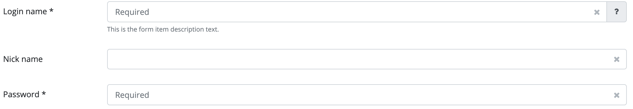
Rendering
By default, the form displays form items stacked upon each other in full width. You can modify this setting to display form items next to each other (inline form).
Displaying an inline form:
Also, you can display a form using one of the built-in renderers or you can create a custom form renderer where individual form items are placed in an arbitrary arrangement.
Built-in form renderers
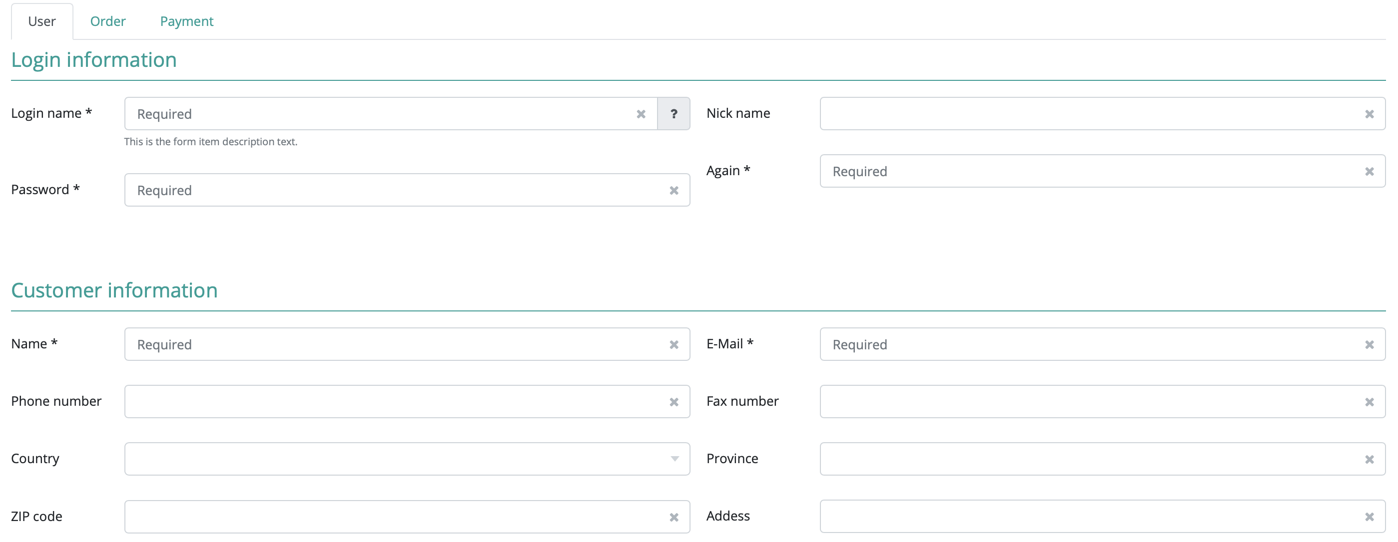
Tabbed form
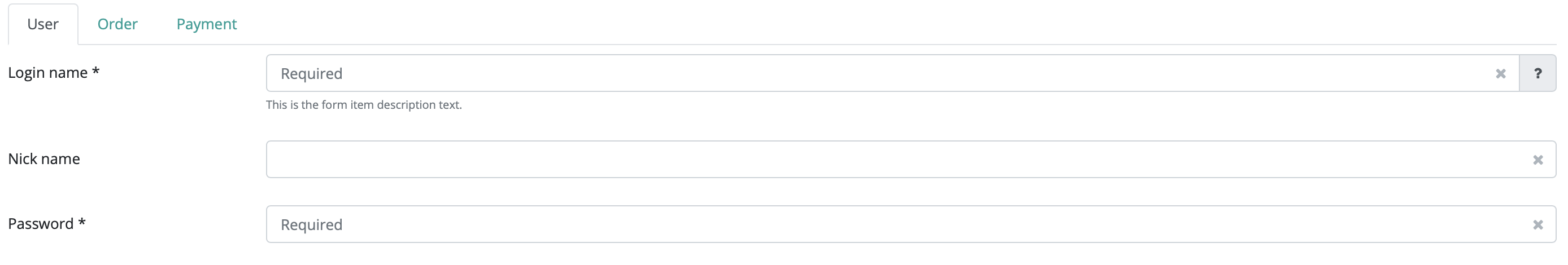
In this display mode, individual form items are placed on the form's tabs to group the items. In order to display a form item on the proper tab, the tab name must be assigned to the form item and a tab must be created within the form.
Applying a tabbed renderer to the form:
Adding a tab to the form:
Assigning a form item to the tab:
You can also specify the parameter in a DataDescriptor column.
Blocked form
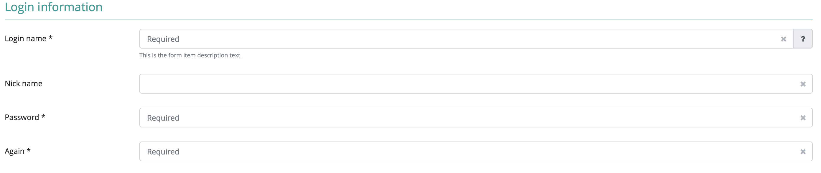
In this display mode, individual form items are placed into blocks within a form. Every block has a title, thus grouping pieces of information. In order to display a form item in the proper block, the block name must be assigned to the form item and a block must be created within the form.
Setting a blocked form renderer on the form:
Creating a block on the form:
Adding a form item to the block:
You can also specify the parameter in a DataDescriptor column.
Columned form
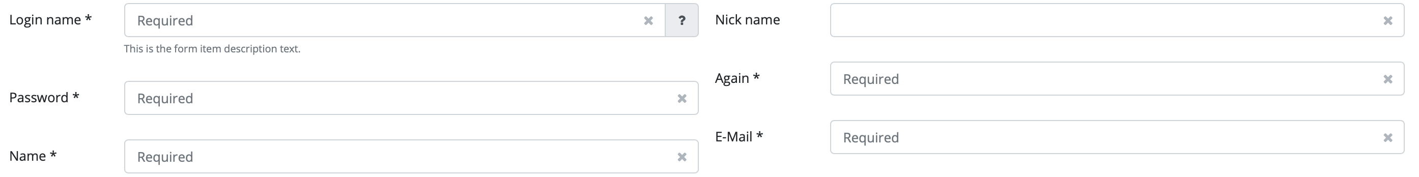
In this display mode, individual form items are placed into a column within the form. In order to display the form item in the proper column, the form item must be assigned to the column and the column must be created on the form.
Setting a renderer for a columned form:
Creating a column on the form:
Adding a form item to a column:
You can also specify the parameter in a DataDescriptor column.
Complex form renderer
Using a complex form renderer means that you can use tabs, blocks and columns simultaneously. All three items (tabs, blocks and columns) must be created on the form and all three parameters must be assigned to the form item. You can also specify which columns should be displayed in which order.
Setting a complex form renderer on a form:
Setting the order of tabs, blocks and columns in a complex form renderer:
Adding tabs, blocks and columns to the form :
Configuring a form item so that it is displayed in the proper place:
You can also specify the parameter in a DataDescriptor column.
Creating a FormBuilder
If the built-in renderers are not suitable for the problem, you can use a custom renderer. This custom renderer is then used by the form component upon displaying the form. First, you have to implement the FormBuilder interface. If the custom FormBuilder uses tabs, blocks or columns, it needs to implement the proper interface. (Interfaces: BlockedForm, TabbedForm, ColumnedForm.) These interfaces make it possible to set the proper items on the form.
Form change handler
The form component offers a special event: form change. This event is triggered when a form value is updated or when the user starts editing a data record on the form (at this point all form items will change). The event handler method receives in a parameter an instance of the changed form component and an instance of the changed form item (if the data record editing has just started, this parameter is null) and the updated data record.
In the event handler, you can process the changed data and perform operations with them. Such an operation can be checking new values or recalculating a field.
Setting a form change handler to the form:
Using a form change handler to recalculate a field. If col1's value is not between 1 and 100, an exception is thrown:
Using a form change handler to recalculate a field's value. col2 should equal the double of col1:
Calculated fields
You can created calculated fields within a form. In order to do this, you only need to specify a calculation method for the given field. If you do this, the field value is automatically calculated when displaying the form. If the field is dependent on the value of one or more other fields, you can set which other fields in the form should automatically recalculate their value if they change. If the calculated field does not need to be recalculated when a form item changes, the form allows you to recalculate all the fields.
Setting a calculation method for the a form item field (adding up the values of column1 and column2):
Sets if the calculatedItem should recalculate the field value if column1 or column2 changes:
Recalculating all form fields from code:
Sending a form to the servlet
With an application developed in JBStrap, you don't need to use servlets. All form data is available in real-time on the server side. However, you might need to send some data to a servlet if an application form is not processed by the application itself. The framework does have a solution for this: set a form action, encoding and sending method the same way you did in HTML. Sending information to the servlet can also be made programmatically.
Setting the form post method:
Setting a form action:
Setting the form encoding:
Sending a form to the servlet:
Style customization
| Name | Type | Default value | Derived value | Computed value | Comment |
|---|---|---|---|---|---|
| $form-font-size | number | $font-size-base | $form-font-size-->$font-size-base-->0.8125rem | 0.8125rem | Form default font size. |
| $form-font-weight | number | $font-weight-normal | $form-font-weight-->$font-weight-normal-->400 | 400 | Form default font weight. |
| $form-label-margin-bottom | number | ($spacer * 0.5) | $form-label-margin-bottom-->($spacer * 0.5)-->(1rem * 0.5) | 0.5rem | Margin under a form element’s name. |
| $form-top-label-text-align | text | left | - | left | Label positioning - Form.setLabelPosition(FormItemLabelPosition.TOP) |
| $form-help-icon-color | color | $white | $form-help-icon-color-->$white-->#fff | #fff | Icon color. |
| $form-help-icon-bg-color | color | $info | $form-help-icon-bg-color-->$info-->$blue-->#007BFF | #007BFF | Icon background color. |
| $form-help-icon-border | negation | none | - | none | Div container frame surrounding the icon. |
| $form-help-icon-border-radius | number | 0.5 | - | 0.5 | Div container radius surrounding the icon. |
| $form-help-icon-width | number | $font-size-base * 1.5 | $form-help-icon-width-->($font-size-base * 1.5) --> (1rem * 1.5) | (1.5rem) | Div container width surrounding the icon. |
| $form-help-icon-height | number | $font-size-base * 1.5 | $form-help-icon-height-->($font-size-base * 1.5) --> (1rem * 1.5) | (1.5rem) | Div container height surrounding the icon. |
| $form-help-icon-size | number | $font-size-base | $form-help-icon-size-->$font-size-base-->1rem | 1rem | Icon size. |
| $form-help-icon-m-t | number | ($spacer * 0.35) | $form-help-icon-m-t-->($spacer * 0.35)-->(1rem * 0.35) | (0.35rem) | Upper margin of the div container surrounding the icon. |
| $form-help-icon-m-l | number | ($spacer * 0.5) | $form-help-icon-m-l-->($spacer * 0.5)-->(1rem * 0.5) | (0.5rem) | Left margin of the div container surrounding the icon. |
| $form-help-icon-m-b | number | ($spacer * 0.35) | $form-help-icon-m-b-->($spacer * 0.35)-->(1rem * 0.35) | (0.35rem) | Lower margin of the div container surrounding the icon. |
| $form-column-min-width | number | ($spacer * 10) | $form-column-min-width-->($spacer * 10)-->(1rem * 10) | (10rem) | Minimum width of a form column. |
| $form-colum-left-margin | number | $spacer | $form-colum-left-margin-->$spacer-->1rem | 1rem | Spacing between two columns. |
| $form-colum-first-left-margin | number | 0 | - | 0 | Spacing before the first column. |
| $form-block-first-top-padding | number | 0 | - | 0 | Spacing on the top of the first form area. |
| $form-block-title-border-bottom | mixed | 1px solid $primary | $form-block-title-border-bottom-->1px solid $primary-->1px solid #079e97 | 1px solid #079e97 | Underlining the title of a form area. |
| $form-block-title-color | color | $primary | $form-block-title-color-->$primary-->#079e97 | #079e97 | Form area title color. |
| $form-control-border-color | color | $border-color-form-item | $form-control-border-color-->$border-color-form-item-->#ced4da | #ced4da | Frame color for input fields. |
| $form-control-color | color | inherit | - | inherit | Text color for the input field. |
| $form-control-clear-btn-color | color | $gray-500 | $form-control-clear-btn-color-->$gray-500-->#adb5bd | #adb5bd | x icon color. |
| $form-control-clear-btn-padding | number | ($spacer * 0.7) | $form-control-clear-btn-padding-->($spacer * 0.7)-->(1rem * 0.7) | (0.7rem) | Inner spacing for the div container surrounding x icon. |
| $form-control-clear-btn-hover-color | color | $danger | $form-control-clear-btn-hover-color-->$danger-->#D9230F | #D9230F | x icon color in case of mouse hover. |
| $border-color-form-item | color | $gray-400 | $border-color-form-item-->$gray-400-->#ced4da | #ced4da | Form frame. |