Treeview Complex component
This chapter discusses the following components
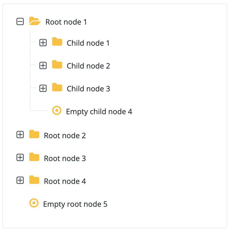
The component enables you to visualize a hierarchical data structure in a tree view on the interface. The component is capable of selecting, expanding and collapsing individual nodes (items).
The component has a default renderer, that allows the the treeview item icon, component, name or label to be specified, but it is also possible to create a custom renderer that uses custom components to visualize a TreeView. Thus, a simple or complex tree can be displayed, in which the data hierarchy is visualized.
The component’s contents may be programmatically specified or automatically using a DataDescriptor. In this case the tree data originates from a DataDescriptor and is displayed based on individual parameter settings.
Supported events:
Show, Hide, Animation, Click, MouseEvents, Scroll, Touch, Drag&Drop
Style customization
Name |
Default value |
Derived value |
Computed value |
Comment |
|---|---|---|---|---|
| $treeview-bg-color | $white | $treeview-bg-color-->$white-->#fff | #fff | Treeview background color. |
| $treeview-item-bg-color-hover | $highlight-color | $treeview-item-bg-color-hover-->$highlight-color-->#eefaff | #eefaff | Treeview item hover background color. |
| $treeview-item-bg-color-selected | $light | $treeview-item-bg-color-selected-->$light-->mix(#f8f9fa, #e9ecef, 50%) | mix(#f8f9fa, #e9ecef, 50%) | Treeview selected item background color. |
| $treeview-color | inherit | inherit | Treeview item text color. | |
| $treeview-folder-color | $yellow | $treeview-folder-color-->$yellow-->#ffc107 | #ffc107 | Treeview folder color. |
| $treeview-folder-font-size | $font-size-base * 1.45 | $treeview-folder-font-size-->$font-size-base * 1.45-->0.8125rem * 1.45 | 1,178125rem | Treeview folder font size. |
| $treeview-folder-margin-right | $spacer * 0.5 | $treeview-folder-margin-right-->$spacer * 0.5-->1rem * 0.5 | 0.5rem | Treeview folder margin to the right from the name. |
| $treeview-border | 1px solid $border-color | $treeview-border-->1px solid $border-color-->1px solid $gray-200-->1px solid #e9ecef | 1px solid #e9ecef | Treeview frame. |
| $treeview-icon-font-family | FontAwesome | FontAwesome | Treeview icon font type. | |
| $treeview-border-radius | $border-radius | $treeview-border-radius-->$border-radius-->0.25rem | 0.25rem | Treeview frame corners rounding radius. |
| $treeview-padding | ($spacer * 0.5) $spacer | $treeview-padding-->($spacer * 0.5) $spacer-->(1rem * 0.5) 1rem | (0.5rem) 1rem | Treeview padding. |
| $treeview-margin-bottom | $spacer | $treeview-margin-bottom-->$spacer-->1rem | 1rem | Treeview margin. |
| $treeview-line | 1px solid $border-color | $treeview-line-->1px solid $border-color-->1px solid $gray-200-->1px solid #e9ecef | 1px solid #e9ecef | Treeview lines. |
| $treeview-node-opener-font-size | $font-size-base * 1.2 | $treeview-node-opener-font-size-->$font-size-base * 1.2-->1.2rem | 1.2rem | Treeview node opening icon size. |
| $treeview-node-opener-color | $gray-700 | $treeview-node-opener-color-->$gray-700-->#495057 | #495057 | Treeview node opening icon color. |
| $treeview-node-opener-font-weight | $font-weight-normal | 400 | Treeview node opening icon font weight. | |
| $treeview-node-opener-icon-size | $font-size-base * 1.5 | $treeview-node-opener-icon-size → $font-size-base * 1.5 | 1.5 rem | |
| $treeview-checkbox-icon-size | $treeview-node-opener-icon-size | $treeview-checkbox-icon-size-->$treeview-node-opener-icon-size-->1.22rem | 1.22rem | |
| $treeview-checkbox-icon-font-size | $font-size-base | 1rem | Treeview checkbox checked icon size. | |
| $treeview-checkbox-icon-color | $gray-700 | $treeview-checkbox-icon-color-->$gray-700-->#495057 | #495057 | Treeview checkbox checked icon color. |
| $treeview-checkbox-border | 1px solid $gray-400 | $treeview-checkbox-border-->1px solid $gray-400--> | 1px solid #ced4da | Treeview checkbox frame. |
| $treeview-checkbox-bg-color | $white | $treeview-checkbox-bg-color-->$white-->#fff | #fff | Treeview checkbox background color. |
| $treeview-checkbox-border-radius | $border-radius | $treeview-checkbox-border-radius-->$border-radius-->0.25rem | 0.25rem | Treeview checkbox frame corners rounding radius. |
| $treeview-element-margin-left | $spacer * 0.25 | $treeview-element-margin-left-->$spacer * 0.25-->1rem * 0.25 | 0.25rem | Treeview item left margin from checkbox. |
| $treeview-element-border-radius | $border-radius | $treeview-element-border-radius-->$border-radius-->0.25rem | 0.25rem | Treeview item corners rounding radius. |
| $treeview-element-font-size | $font-size-base | $treeview-element-font-size-->$font-size-base-->0.8125rem | 0.8125rem | Treeview item font size. |
TreeviewNode
A component representing a node in the treeview component The component is not intended for standalone use, it can only be inserted into the Treeview as node of the tree.
Supported events:
Show, Hide, Animation, Focus, Click, MouseEvents, Scroll, Touch, HotKey, Drag&Drop
Style customization
Name |
Default value |
Derived value |
Computed value |
Comment |
|---|---|---|---|---|
$treeview-node-opener-font-size |
$font-size-base * 1.2 |
$treeview-node-opener-font-size-->$font-size-base * 1.2-->1.2rem |
1.2rem |
Treeview node opening icon size. |
$treeview-node-opener-color |
$gray-700 |
$treeview-node-opener-color-->$gray-700-->#495057 |
#495057 |
Treeview node opening icon color. |
| $treeview-node-opener-font-weight | $font-weight-normal | 400 | Treeview node opening icon font weight. | |
$treeview-node-opener-icon-size |
$font-size-base * 1.5 | - | 1.22rem |
Treeview node opening icon size. |