Duallistbox Formitem component
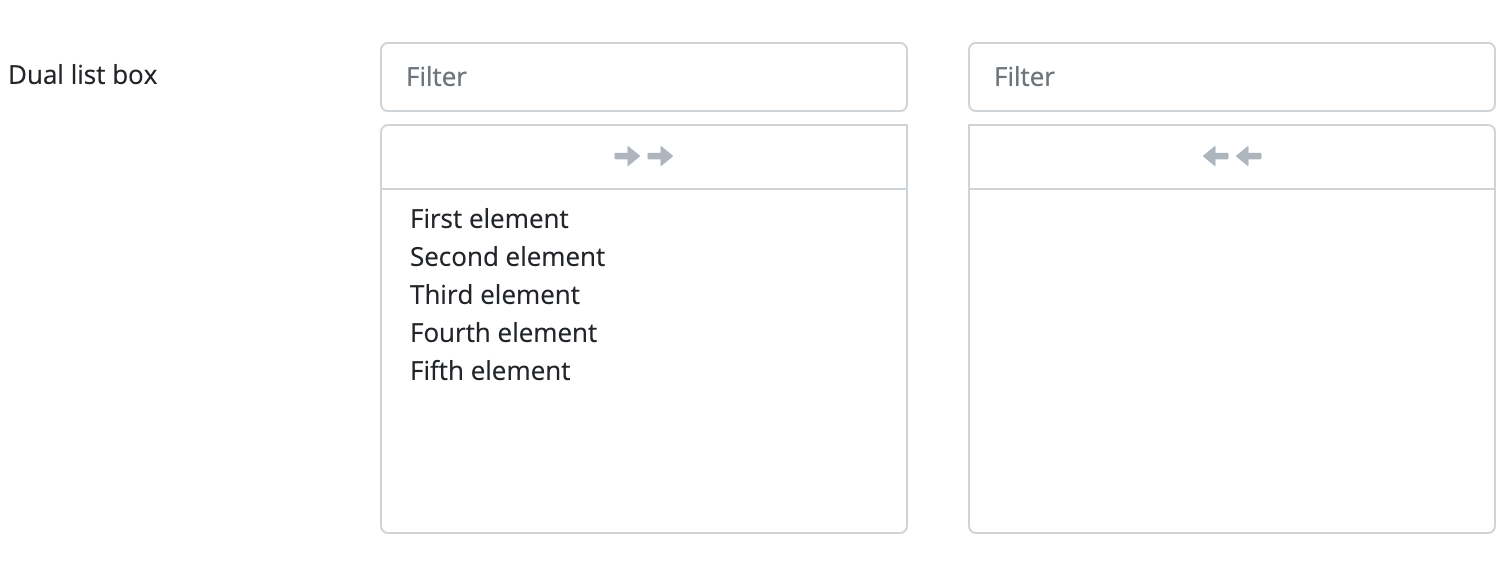
The component implements two parallel lists. The lists display the values passed to the component. By default the component’s value set is displayed on the left. The user is able to move one or several items to the list on the right. The list on the right contains items selected by the user. These items are the component’s value. The component provides a selection option which enables the user to select several items from a value set and save it to a given field.
The dual list box component is a form item which means it can be placed on the Form component. The standalone use of this component requires the implementation of event and value handling from code.
The component enables the user to move items from one list to the other by clicking on them. Buttons above the list make it possible to move all items from one list to the other at the same time. Lists can be filtered individually if there is an input field above the list.
It can be created, programmatically. This means that the component is created manually, it is placed on the interface manually, and its set of values are also defined manually, through the code.
Supported events:
Show, Hide, Change, Focus, Animations, HotKey, Drag&Drop
Style customization
Name |
Default value |
Derived value |
Computed value |
Comment |
|---|---|---|---|---|
| $dual-listbox-height | 20rem | 20rem | Dual ListBox height. | |
| $dual-listbox-font-size | $font-size-base | $dual-listbox-font-size-->$font-size-base-->0.8125rem | 0.8125rem | Dual ListBox font size. |
| $dual-listbox-bg-color | $white | $dual-listbox-bg-color-->$white-->#fff | #fff | Dual ListBox background color. |
| $dual-listbox-color | $body-color | $dual-listbox-color-->$body-color-->$gray-900-->#212529 | #212529 | Dual ListBox label color. |
| $dual-listbox-btn-color | $gray-500 | $dual-listbox-btn-color-->$gray-500-->#adb5bd | #adb5bd | Dual ListBox button arrow color. |